
5 design lessons from Aloma
The weekly micro-decorating newsletter * Issue 8 of 13, SS26 * Subscribe free *
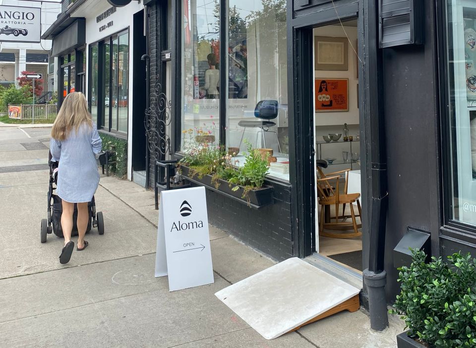
Leslieville used to have a string of vintage shops that dwindled over time, pushed to near extinction by online commerce and rising rents. Lately, they've been springing up again, perhaps a sign that pixels can't compete with the thrill of discovering beautiful things in person. Last month, a pop-up called Aloma joined the fray, and after two visits I can happily report that it's a fine addition to the neighbourhood.
The creative visionary behind the store is Shaughn Colbran, a longtime resident of Leslieville. Her venture's name is borrowed from the elementary school she attended in Brampton, a modernist building that impressed her as a child. She went on to study photography at Sheridan College, which didn't surprise me because there's a sense of careful composition uniting every corner of the compact space.
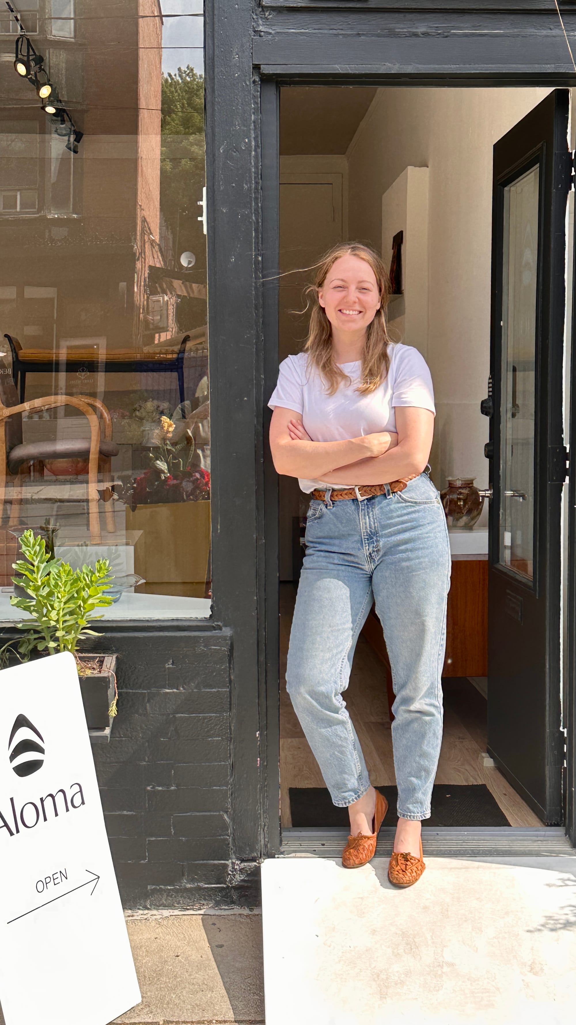
The shop first took shape in Orangeville, after Shaughn came across a space on Facebook Marketplace that turned out to be surprisingly suitable, despite needing lots of work. After renovating it with her partner, and running it for almost three years, she jumped on an opportunity to relocate the business close to home, where she'd benefit from more walk-ins and word of mouth in her own community.
So let's go inside and look around. Rather than highlighting individual pieces, I thought it would be fun to explore some design principles behind the thoughtful arrangements, especially since they illustrate themes we've been exploring all along in this newsletter. Here are five moments that stopped me in my tracks:
Double up
A well-designed object gets extra oomph when it's paired. These Hans Wegner chairs placed side by side are a power couple:
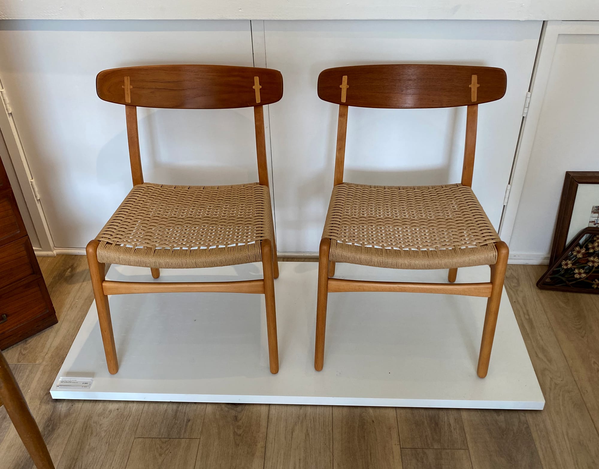
There's an elegance in the joinery, and seeing it repeated brings the craftsmanship home:
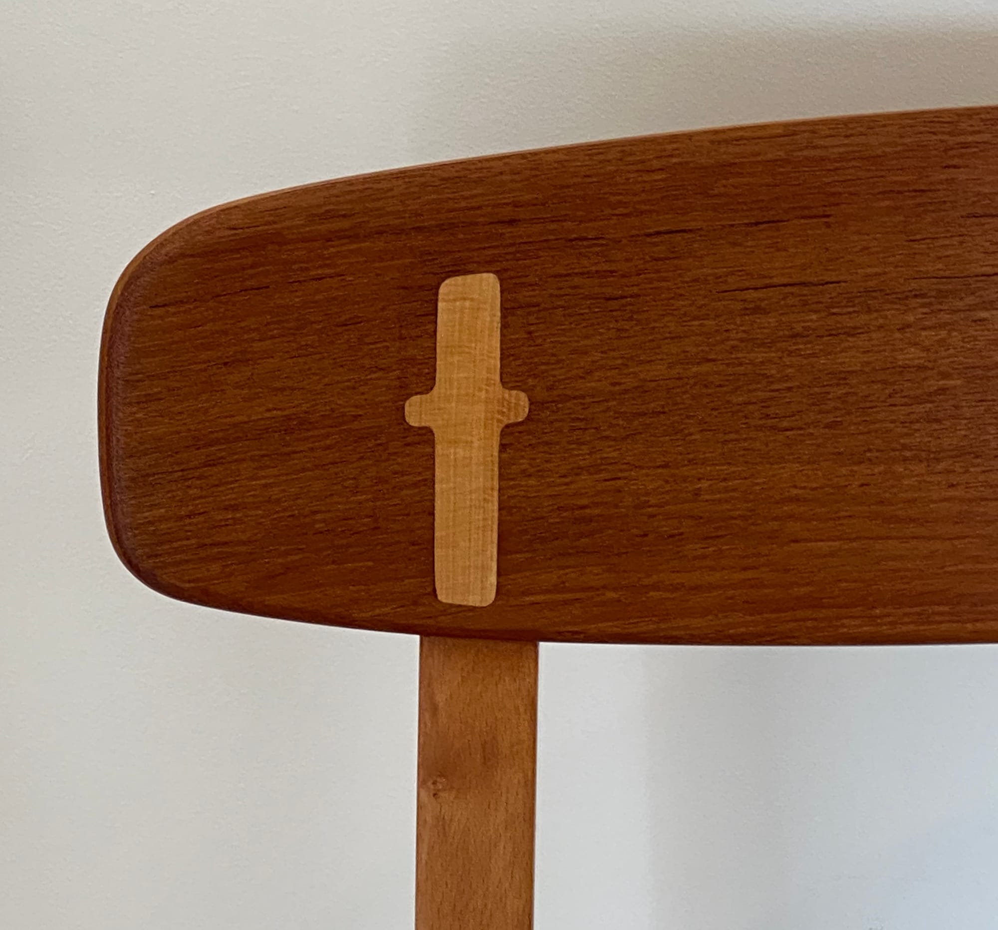
The doubling effect is a surefire way to make a strong statement in a room.
Leave space
Shelves don't need to be full to be appealing, in fact, gaps can make displayed items more intriguing. This low shelving unit balances refined objects with substantial space, giving your eyes room to roam:
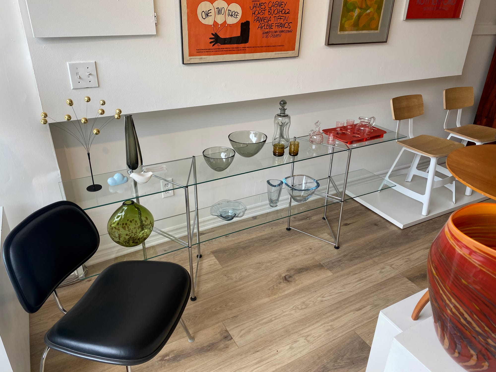
When shelves are glass, there's even more breathing room around the things they support:
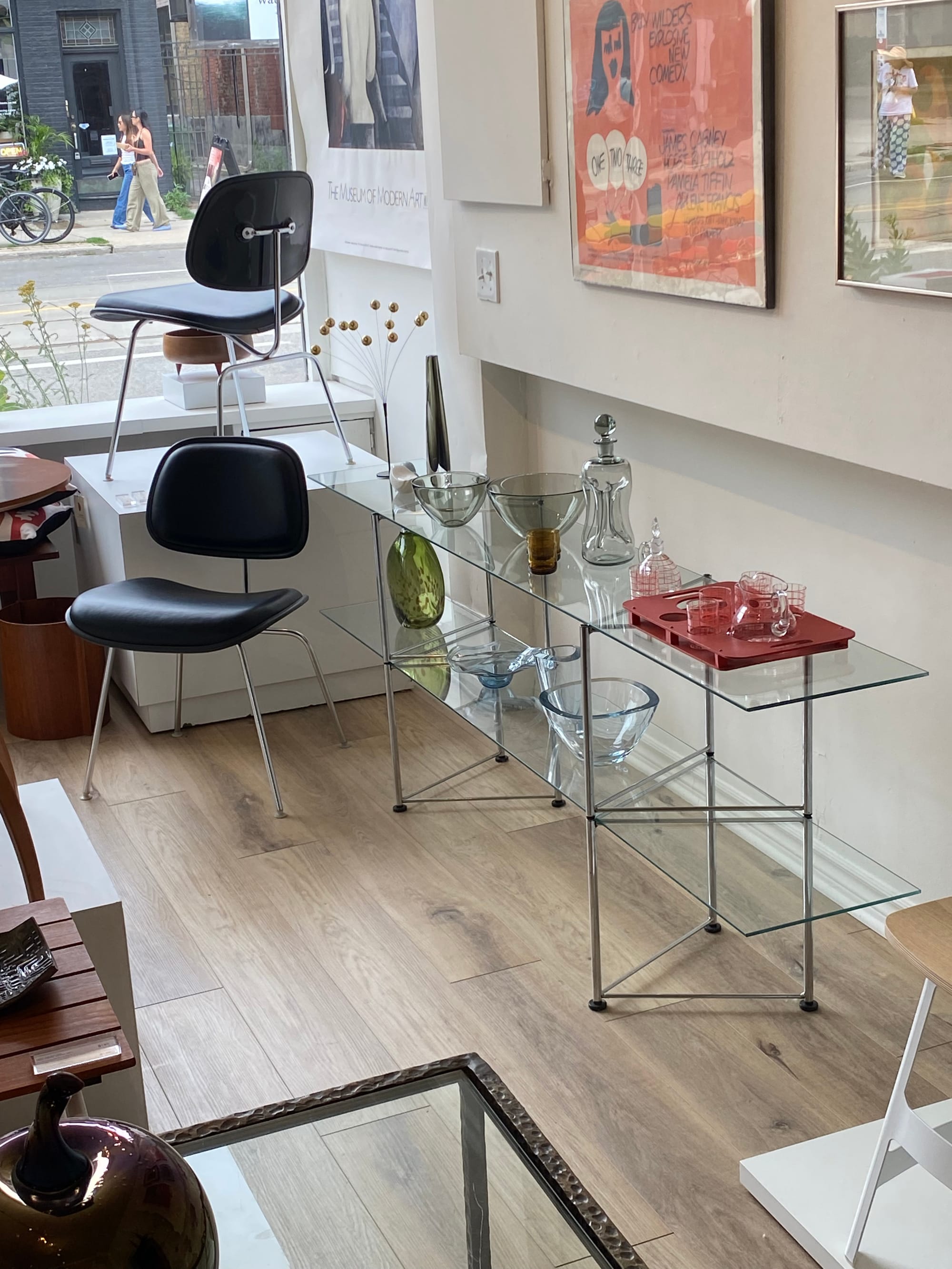
Playing with negative space is a reliable route to compelling design.
Get angular
Square or rectangular supports may lead you to believe things on top need to be aligned with the edges. The truth is, giving some items a wonky placement can be a pleasing alternative, as these pillows show:
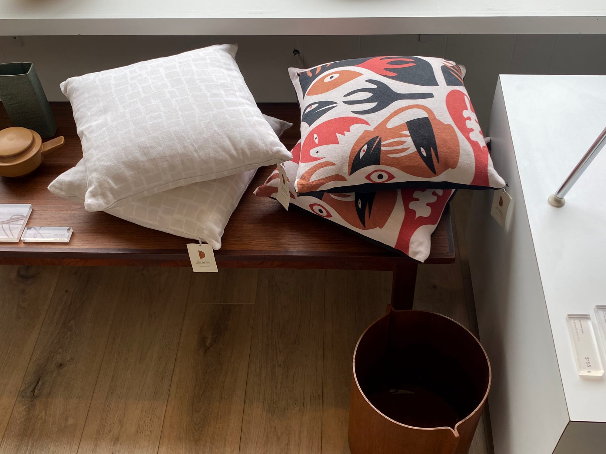
When you're puzzling over an arrangement, try giving something a twist.
Vary your levels
Just as pieces of music gain from mixing loud passages with soft, rooms benefit from displays at varying heights. At the centre of Aloma, a cluster of plinths and small tables make design objects a multi-levelled attraction:
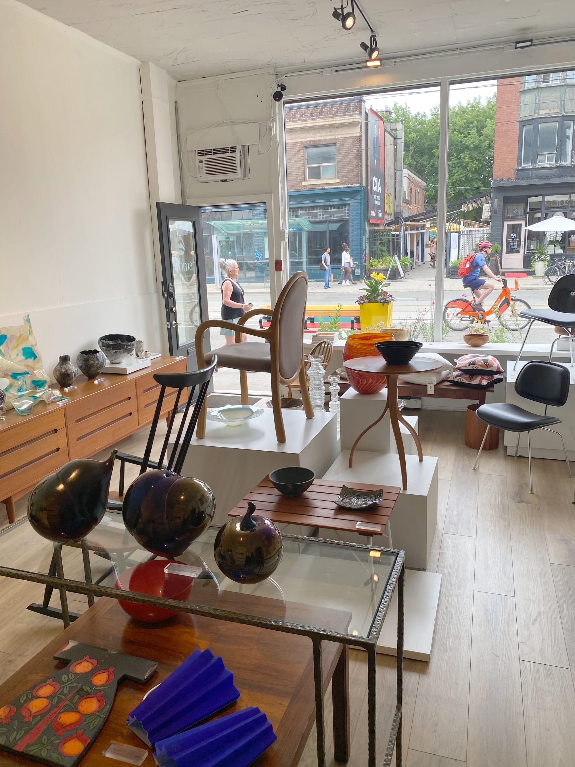
You can pull this off at home by giving thought to what you're elevating.
Link inside and outside
Well-designed spaces often draw our gaze to how indoors and outdoors connect. At Aloma, a generously-sized window becomes a stage for some of the most eye-catching pieces:
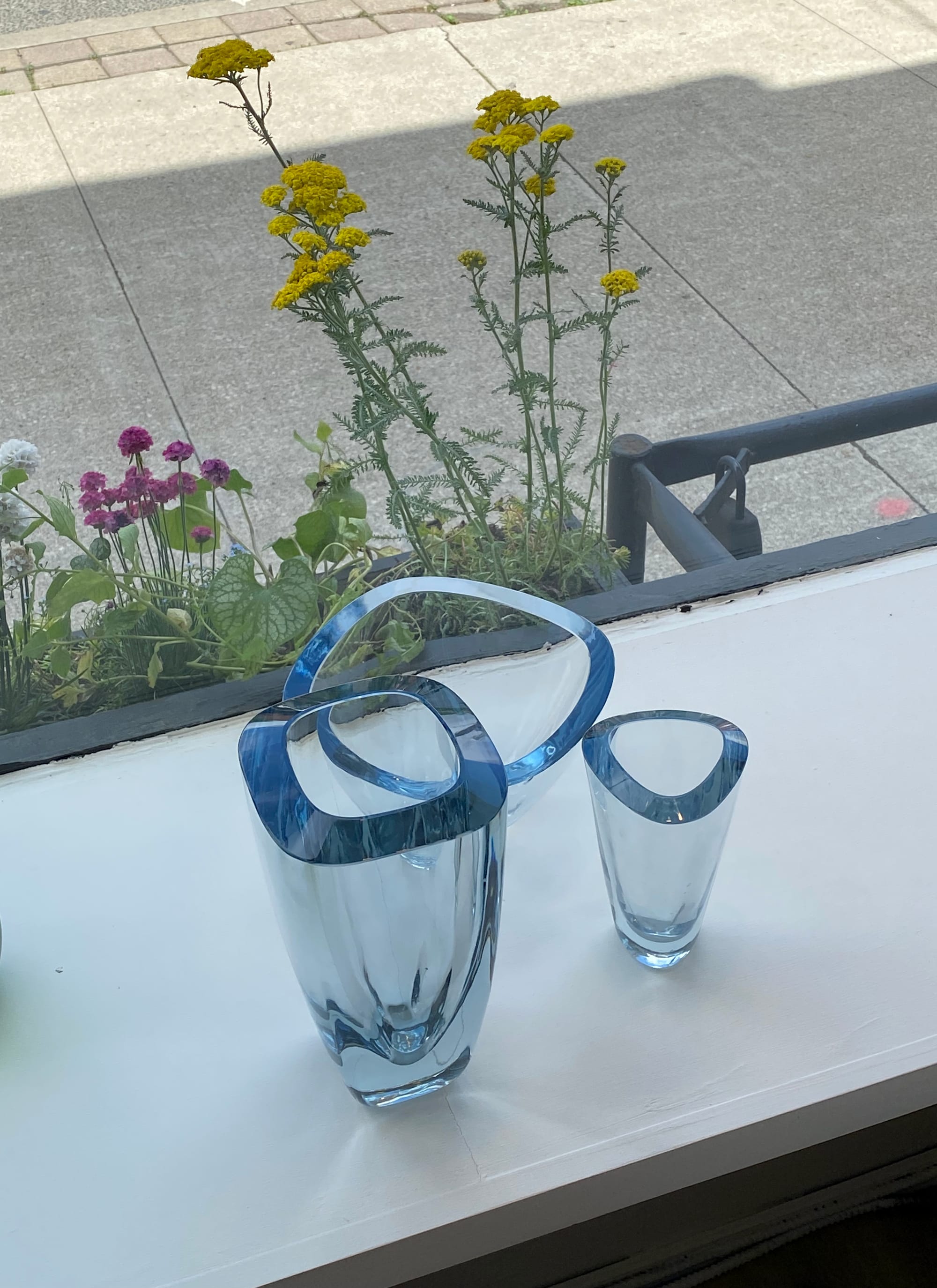
It's a reminder to consider the potential of a mundane area of your home: the windowsills.
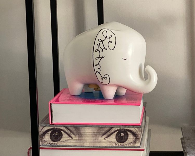
Of course, design principles aren't the only thing on offer at Aloma. The objects themselves are awaiting new homes and there might be just the find for yours. While there are some investment pieces here that take time to consider, there are also plenty of items for under a hundred dollars. This past Sunday, I picked up two affordable pieces for my collection. I'll save them for future newsletter issues – stay tuned! (One of them is pictured in these photos.)
You can visit Aloma at 1107 Queen Street East and also at aloma.ca. You'll find a mix of vintage pieces and contemporary craft. Thank you, Shaughn, for adding your design intelligence to this increasingly vibrant stretch of our city!
From the archives
Five years ago, when pandemic restrictions were starting to loosen, I wrote a piece about how to navigate bricks-and-mortar vintage shops. We'd been cooped up for so long that the art of examining objects in real life had almost been forgotten.
I took another look at the article and the guidelines still hold up now. Best of all, they rely on a clip from a Jacques Tati movie to make their point:
 Guy Koolhof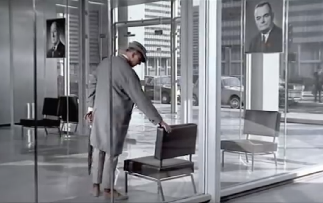
Thank you for reading – and watching!
They can sign up here. It's published on Wednesdays.




Member discussion