Holiday reading + More

The weekly micro-decorating newsletter * Issue 12 of 13, A25 * Subscribe free *
When you need a break between wrapping gifts, or a diversion while cookies are baking, here are some design articles I've enjoyed recently. Hope they light up a dark December night or two.
On staging
My favourite design article of the year was this profile of legendary home stager Jason Saft, who specializes in turning pumpkins into carriages, with the sales figures to prove it. It's a telling tale about how aspiration is embedded in our quest for the perfect home, and how savvy business people can capitalize on it:

On inhaling
We tend to forget about scent when it comes to designing a space, so this article comes as a revelation. It's a fascinating look at instances where the roles of perfumer and designer are one and the same:

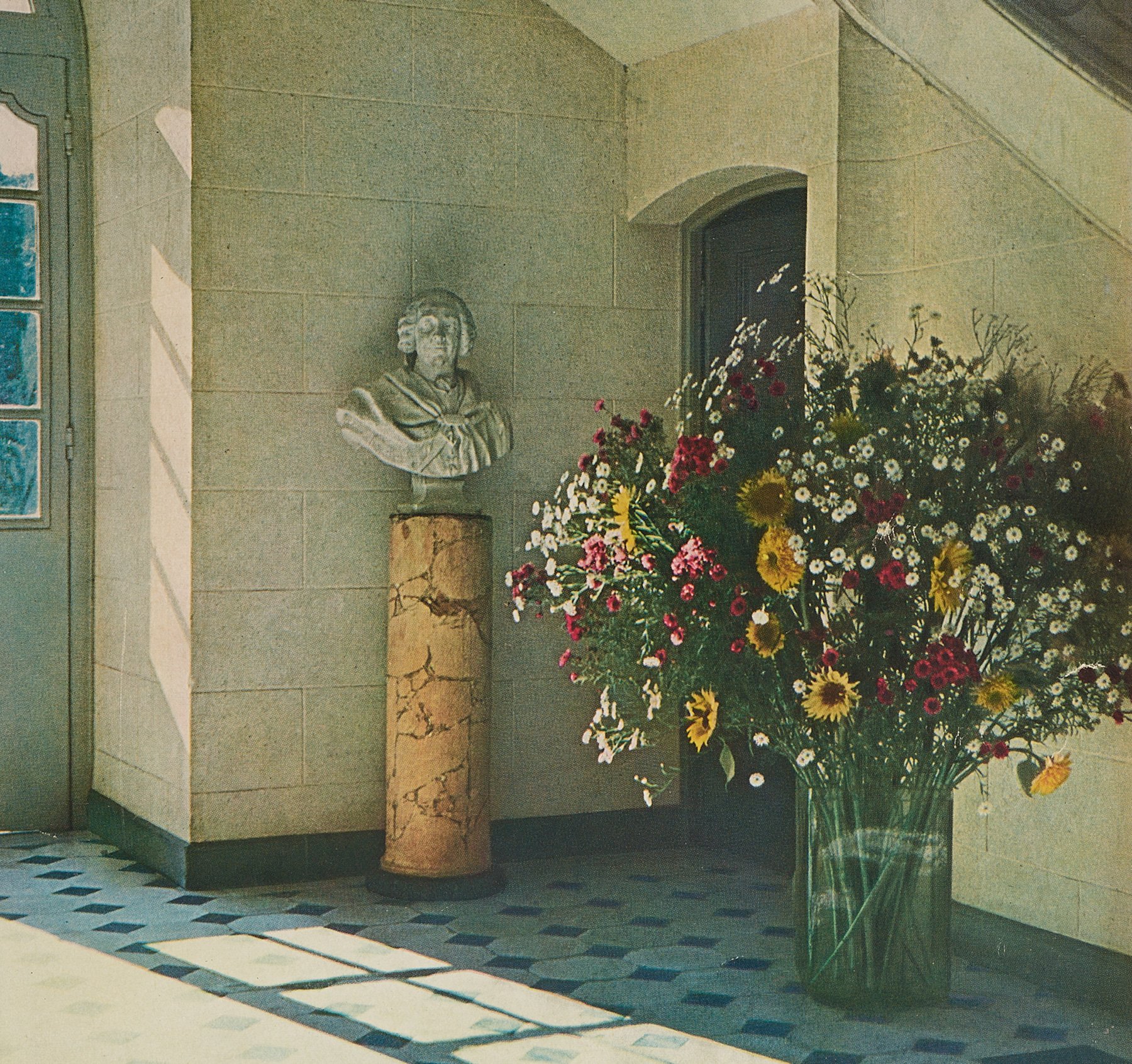
On perusing
Like many Generation X kids, I became interested in interior design via magazines, in particular the Decormags that my Mom had laying around. So, this piece about a writer's early obsession with House & Garden magazine feels familiar and true, especially in its description of how photos of interiors can transport us:
On envying
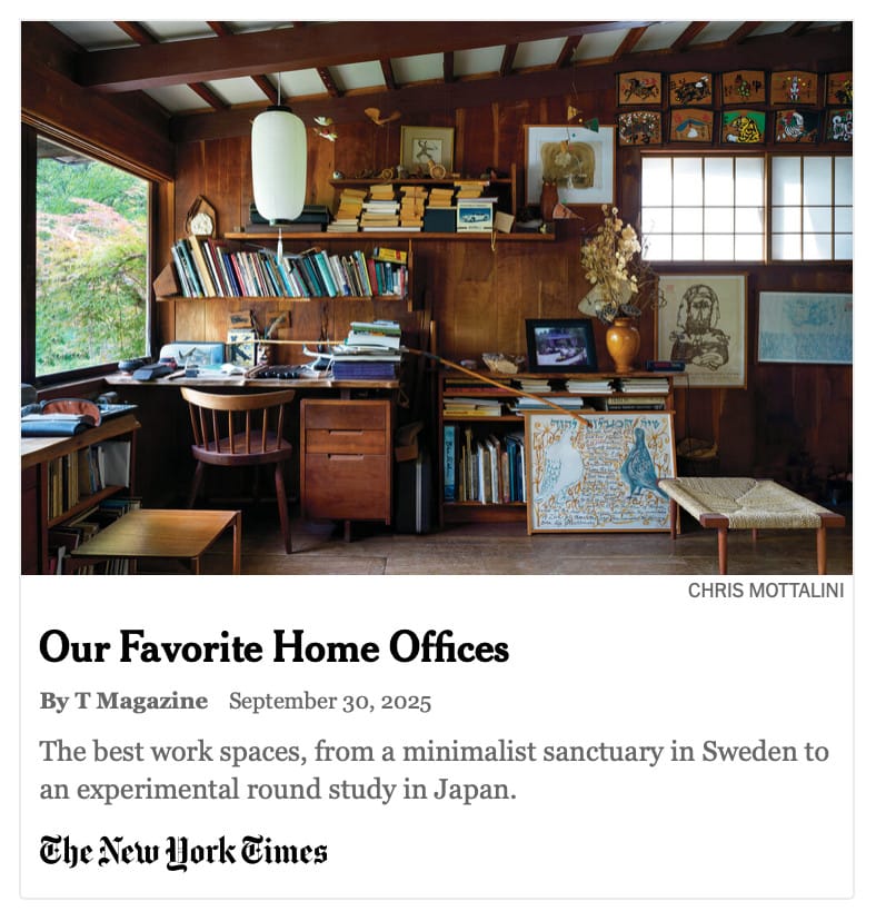
Home office design is probably the last thing on your mind in December, as the logistics of celebration take over. But there's no harm in fantasizing about what your workspace could be like in the new year. Check out this roundup of inspiring designs from around the world, including some peeks into home offices of famous actors:
On rediscovering
Toronto is an unsentimental place that often lets unique features of its cityscape vanish with little notice. This article on abstract painter Rita Letendre's murals is yet another entry in our annals of disappearance:

You can still enjoy her paintings at the AGO, and in a happy twist, in one public space in Toronto. Read the article to the end to find out where it is.
Sightings
Look'n'learn
In browsing bookstores lately, I've been noticing more and more titles with decorated edges. The most over-the-top version I've seen to date is this special edition of Elena Ferrante's Neapolitan novels, with a moody seascape on the side:
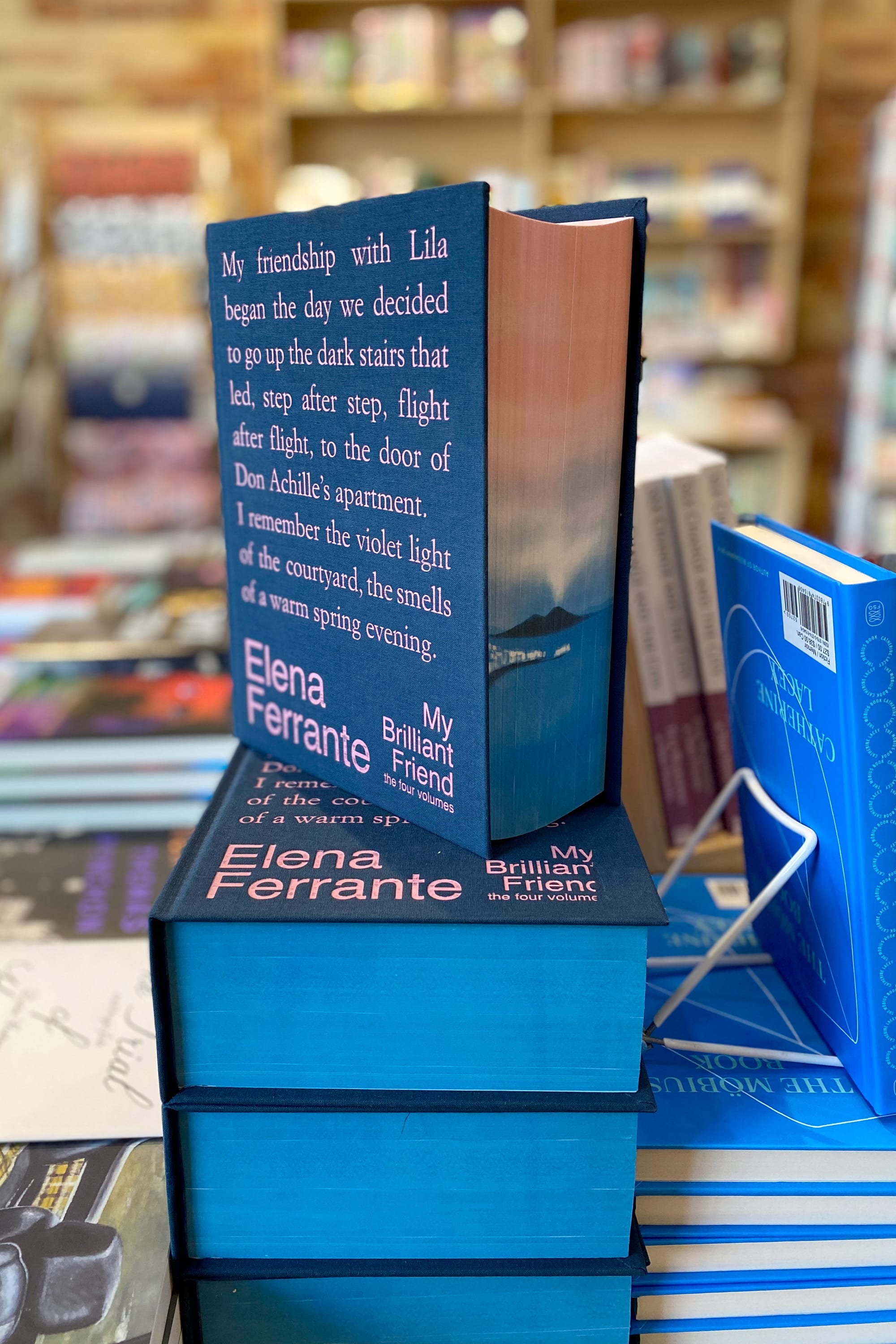
I love the way it flips expectations by including only text on the cover and a scene-setting view where you'd least expect it, around the corner. I was curious about why this trend is blossoming, so I did some Googling and came across this explanatory article in Reader's Digest: Here’s Why So Many Books Now Have Colorful Edges. It's a great little primer on the hows and whys of this seemingly new approach, which actually goes back centuries. Give it a read and your eyes will be well-prepared for your next bookstore visit.
Thank you for reading.


Member discussion