In praise of asymmetry
The weekly micro-decorating newsletter * Issue 2 of 13, A25 * Subscribe free *
What do Colin Farrell's eyebrows have to do with interior design? Take a look at this photo of him by Gray Sorrenti and I'll explain:
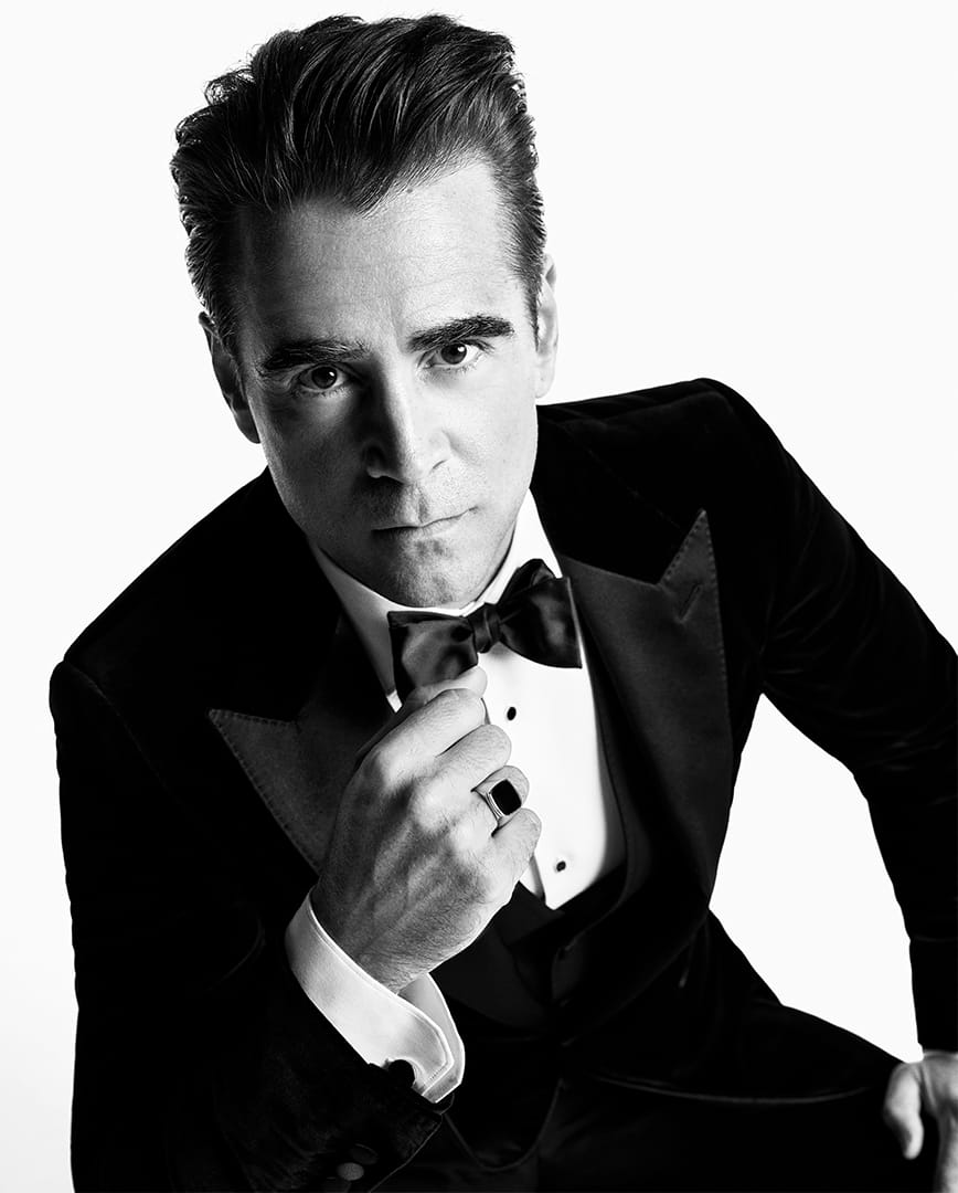
The tilted pose makes it hard to see at first, but tip your head in the same direction as Colin's and it's obvious: his right eyebrow is noticeably higher than his left. It's detectable in almost any photo of him and while you may not always be conscious of it, the effect is vaguely unsettling. The symmetry of a classically handsome face is thrown off slightly, somehow creating added intrigue. You're experiencing the subtle power of asymmetry.
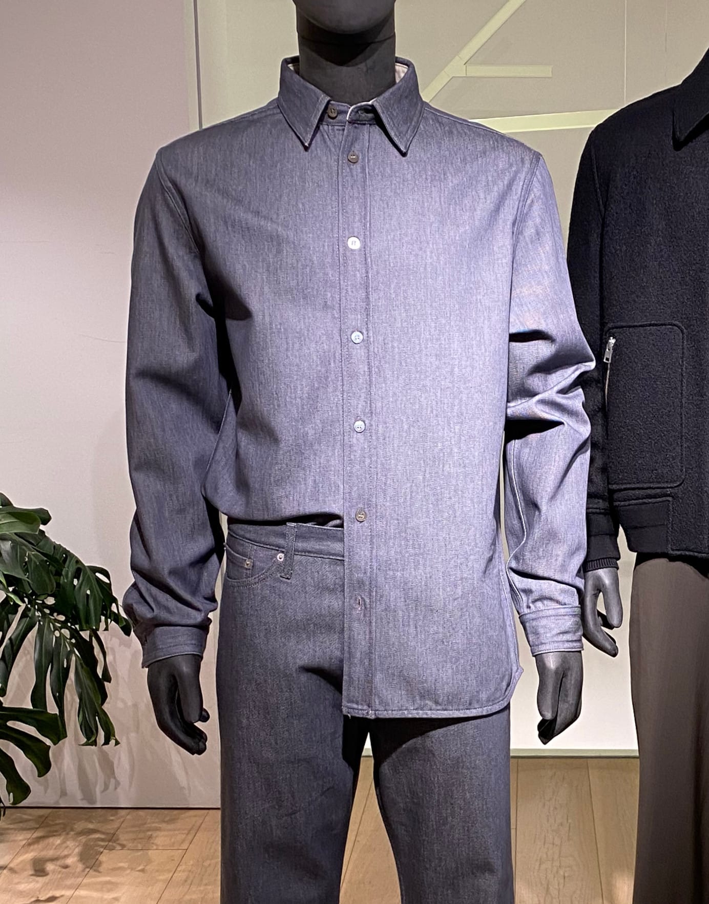
It's an effect with a long history. Think of the traditional pocket square in a man's tailored suit: the balance of the outfit gains intensity from the flash of colour that disrupts it. Now that that's an increasingly rare sight, I've noticed other ways to interfere with mirrored perfection coming to the fore. On a recent visit to my favourite clothing shop, Cos, I spotted a mannequin with this unusually styled shirt:
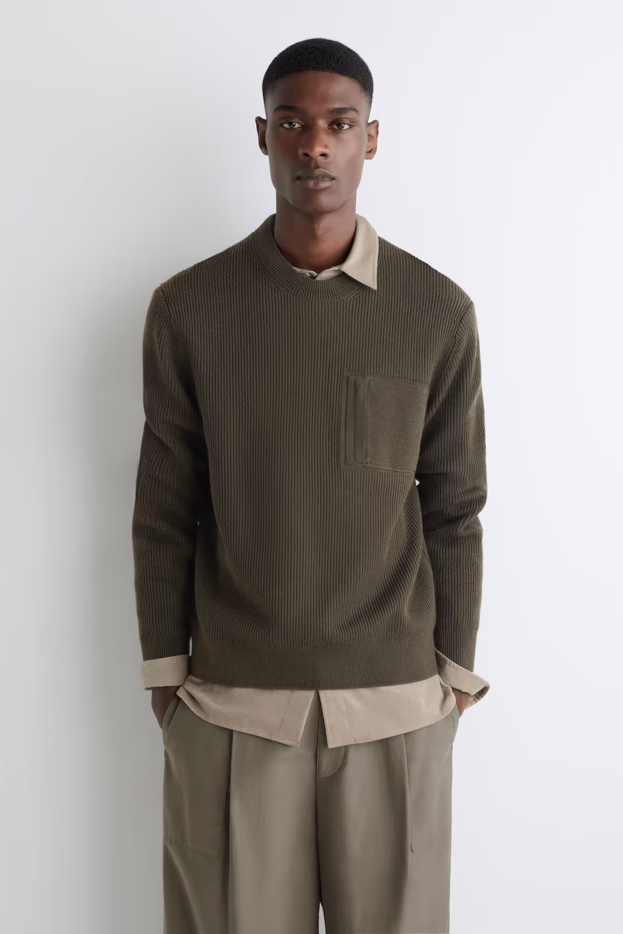
I've seen this look out on the street occasionally, and if the autumn collection at Cos is any indicator, it's a flourish that might spread to shirt collars as well:
It's no wonder, then, that this attention-sharpening move works just as well in thoughtfully designed rooms. While visiting a friend in Montreal this summer, I was taken with this scene in his entryway:
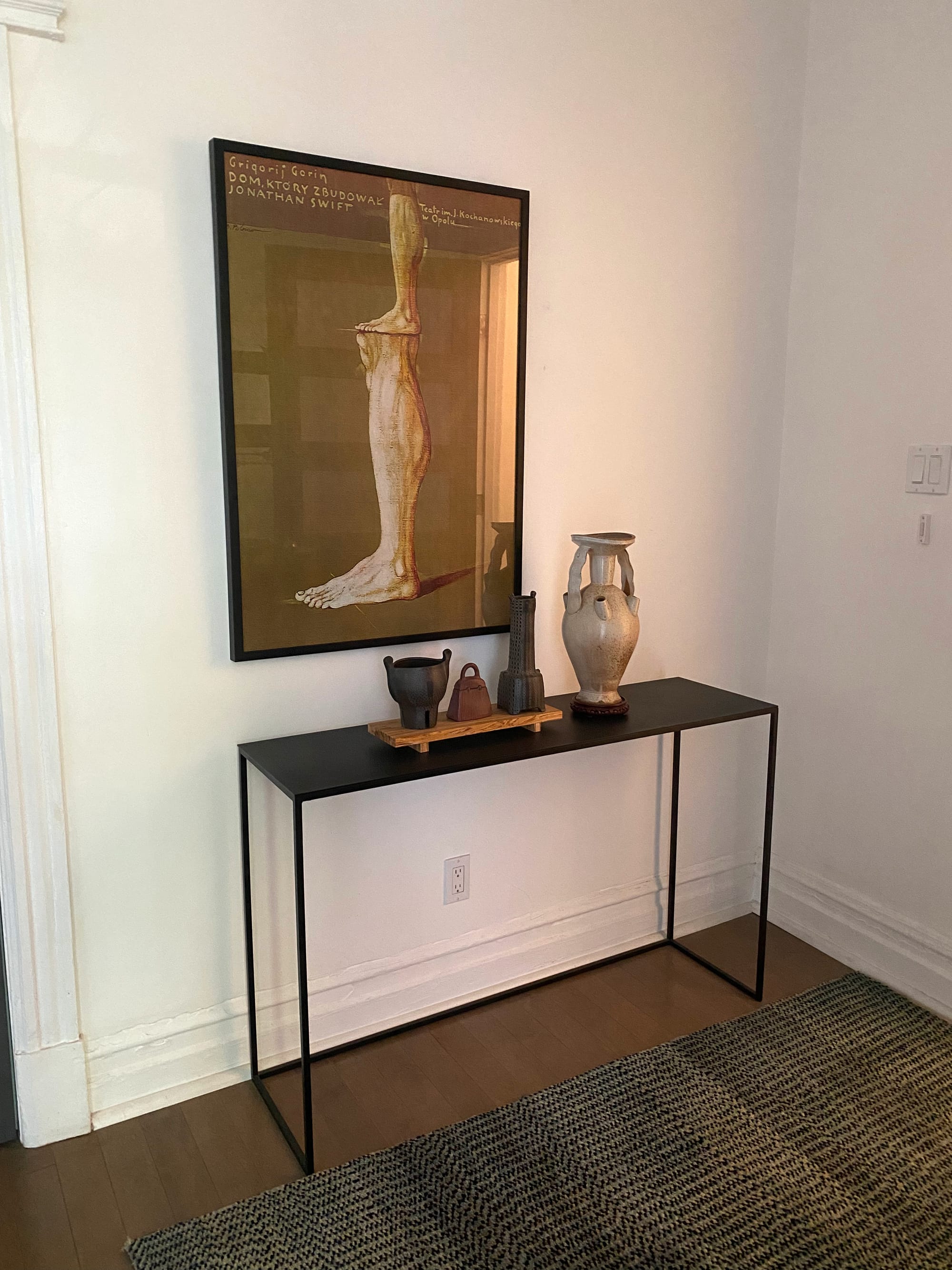
A more conventional mind might have centred the artwork above the console table, leaving an equal space on each side. Left-aligned, it's pleasingly off-kilter. My friend explained that there had been a lamp on the right side, perhaps motivating the shifted layout, but it doesn't need anything else to make perfect sense.
The beauty of asymmetrical shifts like this is it takes little to pull them off. A Thomas vase I acquired at Zig Zag looks rather stiff with its graphic circle carefully centred:
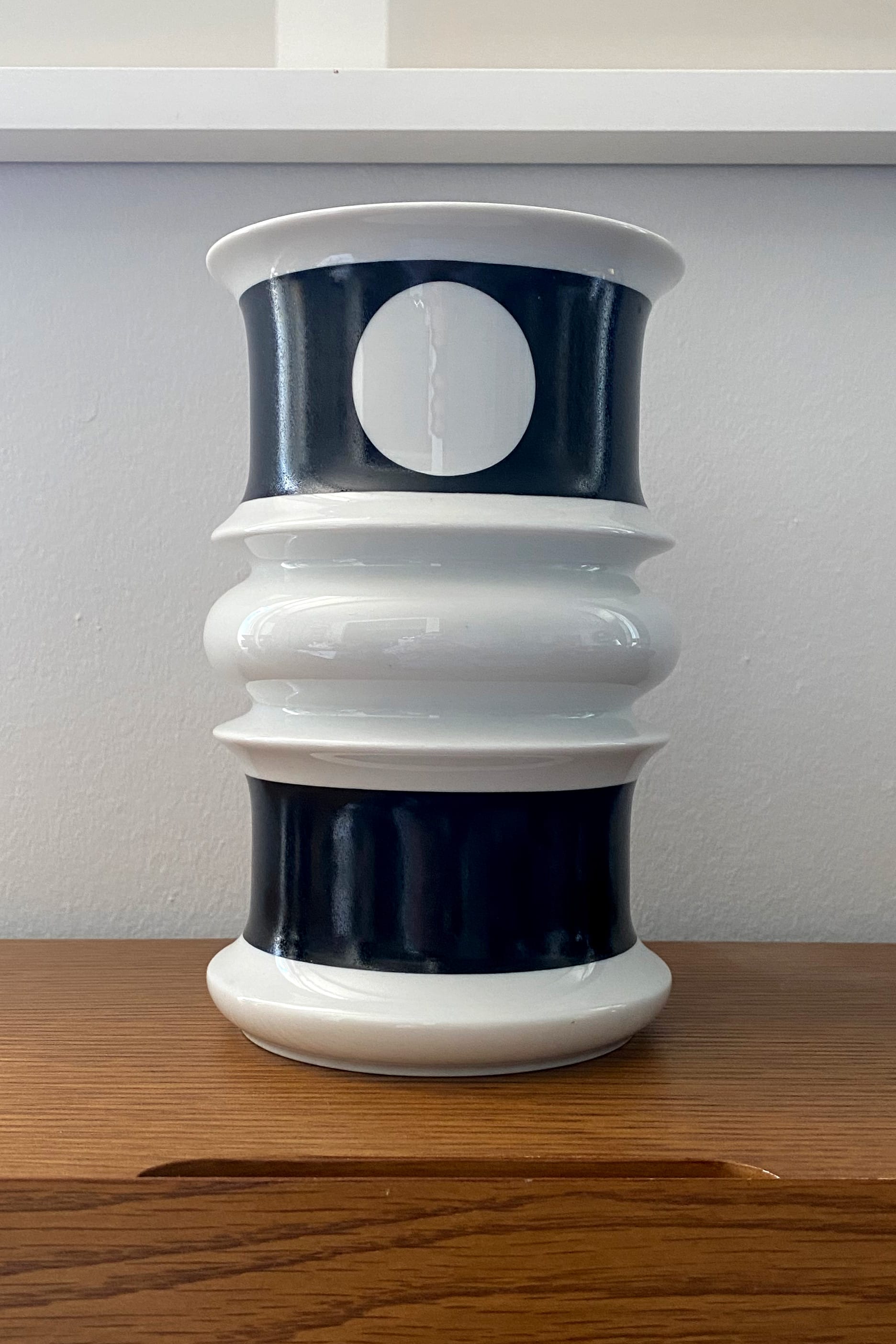
With a twist, it gains a certain mystique:
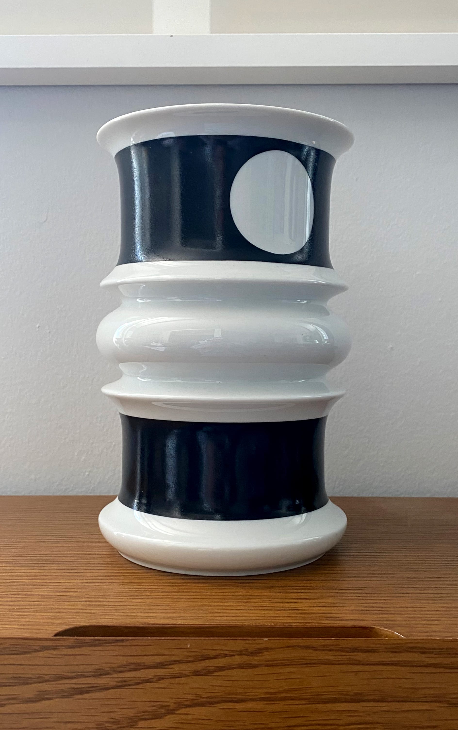
I've always thought of this vase as a Cyclops: staring straight ahead, it looks too aggressive, but gazing off into space, it has a dreamy allure.
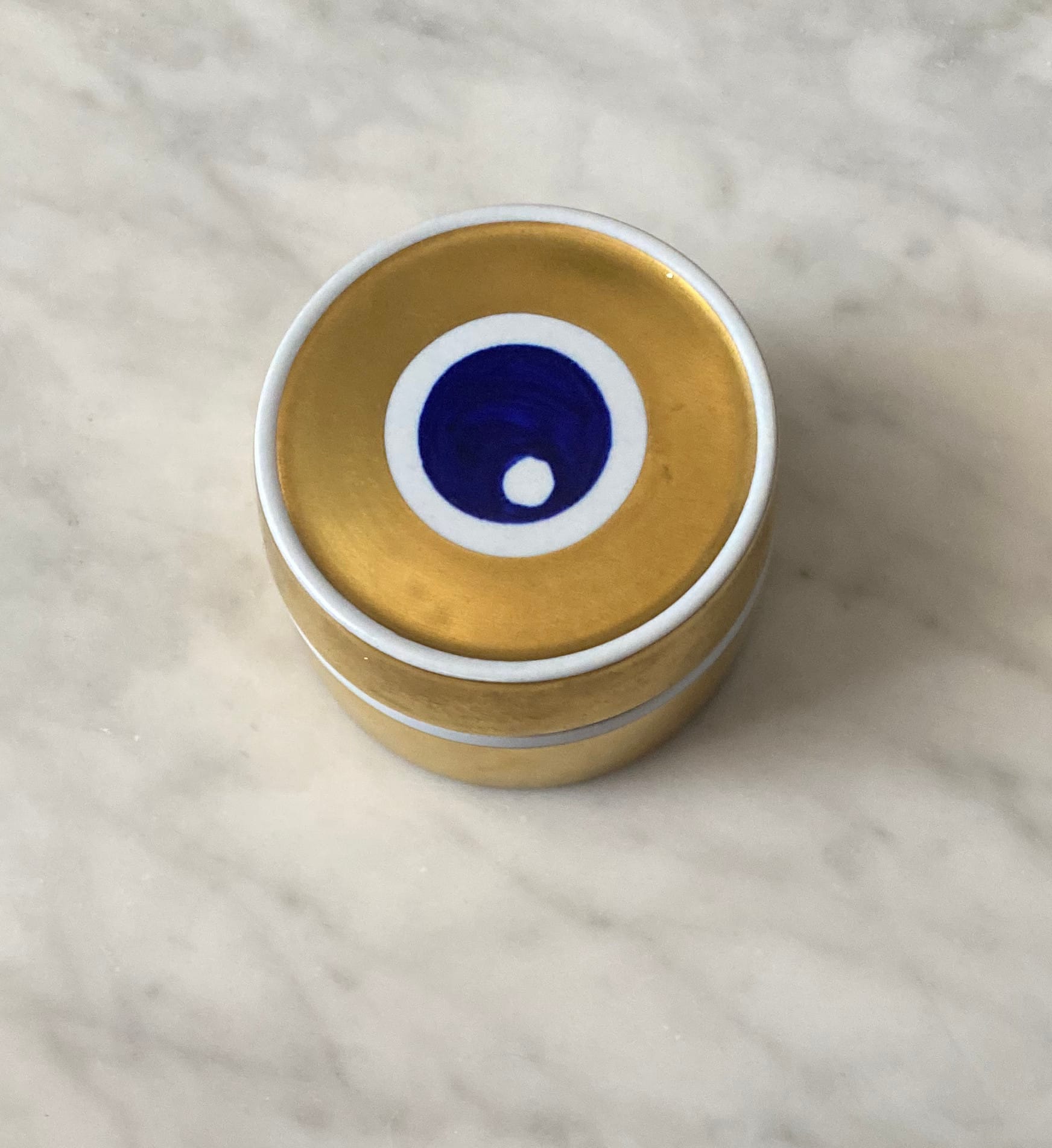
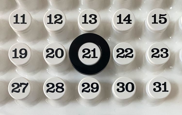
When an object has asymmetry built-in, I find it near-impossible to resist. I picked up this tiny porcelain box at Inabstracto. If the white dot had been centred like a target, I probably wouldn't have even noticed the item. That improbably "off" positioning made the whole thing adorable:
If you're in full-on redecorating mode, it's not hard to find contemporary designers who take on the drama of asymmetry with finesse. The Polder Sofa by Hella Jongerius is a modern classic for this reason:
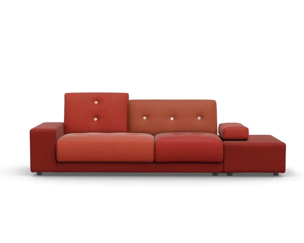
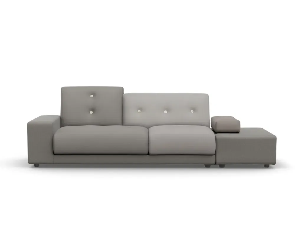
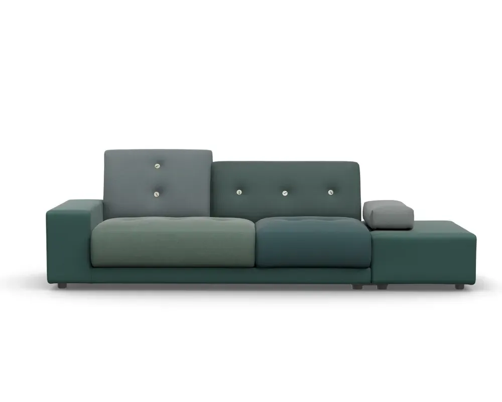
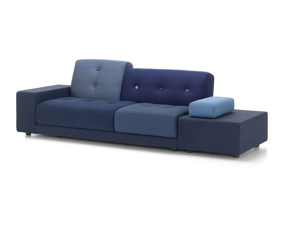
Photos courtesy of GR Shop
Whatever your budget, whatever your energy level, there's an asymmetry for you. If you're setting up a gallery wall, start with the largest piece and make sure it's further to the right or left than you think desirable. If you're styling a sofa, skip the banality of a matching throw pillow in each corner, and go for a surprising contrast.
And... when it comes to designing your social life, choose just the right moment to raise an eyebrow. If it works in Hollywood, it might work for you.
Thank you for reading.


Member discussion