In praise of primary colours

The weekly micro-decorating newsletter * Issue 4 of 13, W26 * Subscribe free *
Who's your favourite artist? Your answer provides a useful clue about how to design your ideal home. An actual artwork of theirs may be out of reach, but you can take the essence of their practice and use it as a prompt for re-imagining your surroundings.
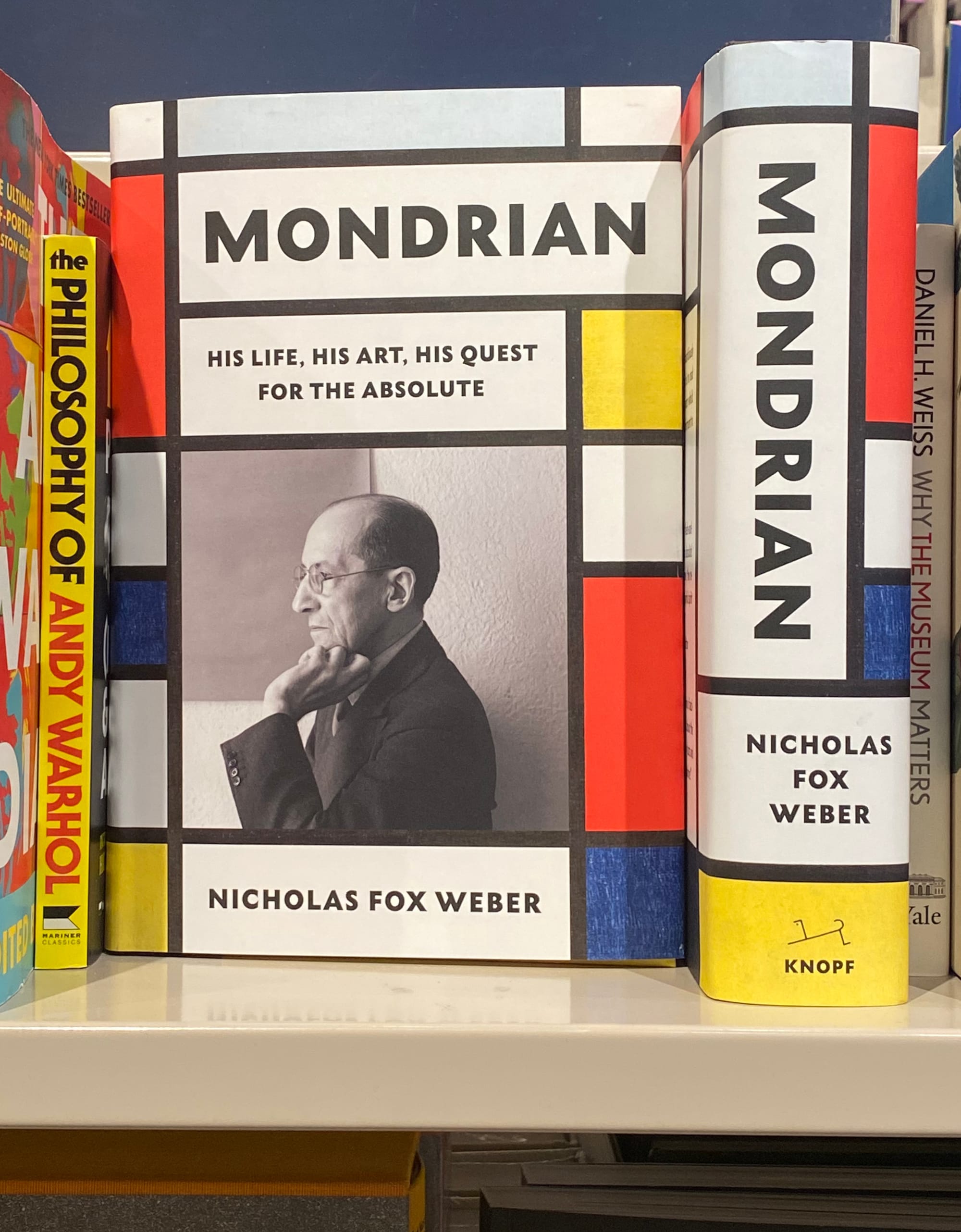
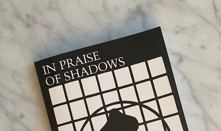
In my case, the answer is Piet Mondrian. It might be my Dutch background predisposing me to admire him, but I tend to think his pioneering experiments with red, yellow, and blue would win my allegiance regardless. Even wrapped around a book, his visual language still has the power to startle:
That may be why interiors that make smart use of primary colours are always among my top sources of inspiration. If I had to pick one favourite shot from my past few years of browsing shelter magazines, it would be this one:
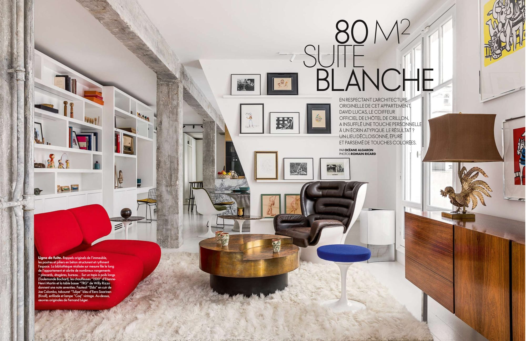
Like a Mondrian painting, this compact apartment is an austere composition punctuated by blasts of colour – the red sofa, blue stool cushion, and yellow background to a Fernand Léger print.
In my own space, primary colours tend towards sillier uses. If you've been reading this newsletter for a while, you'll know that my entryway is flanked by a framed Rolling Stone magazine with Taylor Swift on the cover:
I'm not a Swiftie, I just fell for the striking combo of azure-blue backdrop, acidic-yellow blouse, and coral-red slash of lipstick, thinking it frame-worthy. The sly reference to Edvard Munch's "The Scream" helped too.
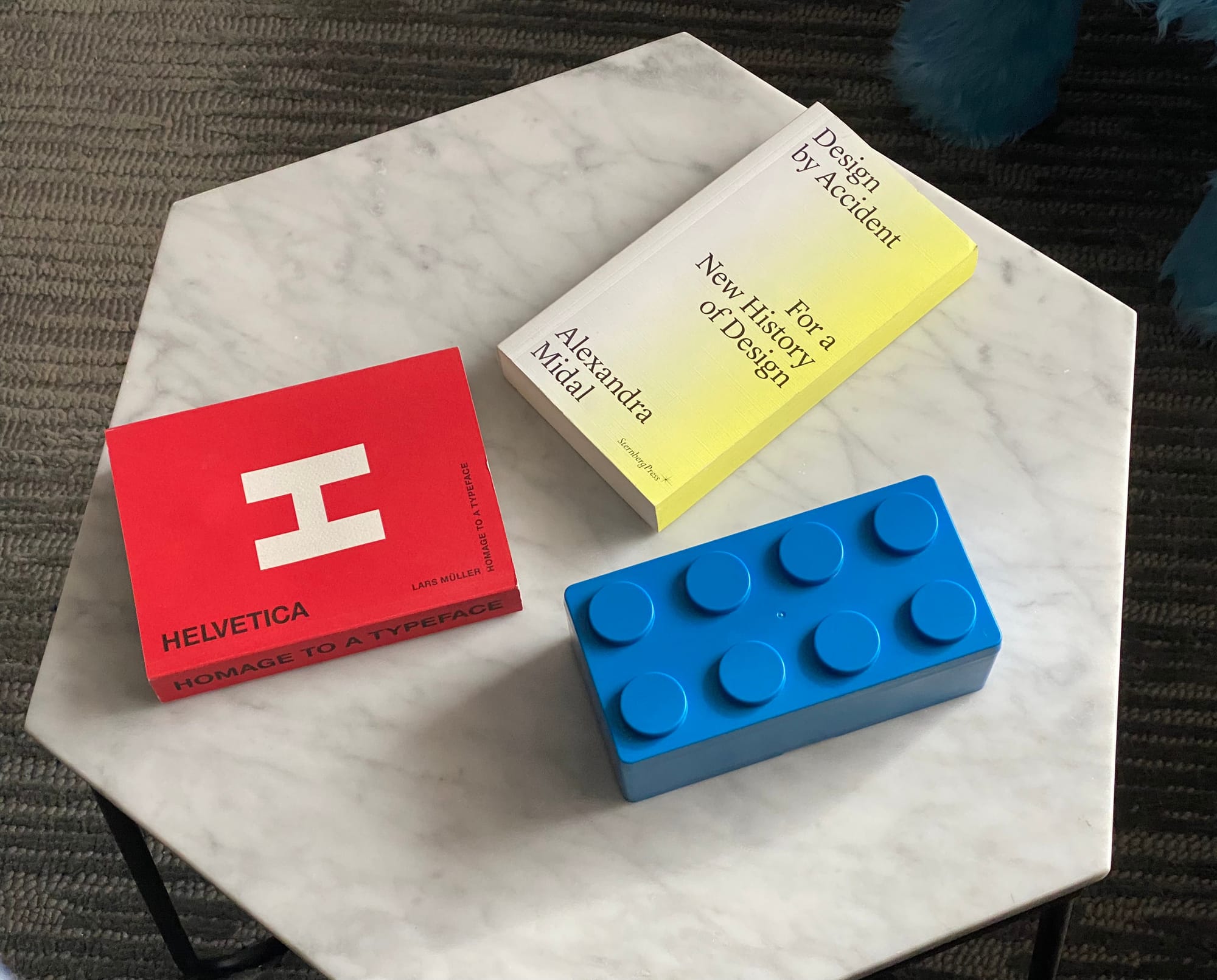
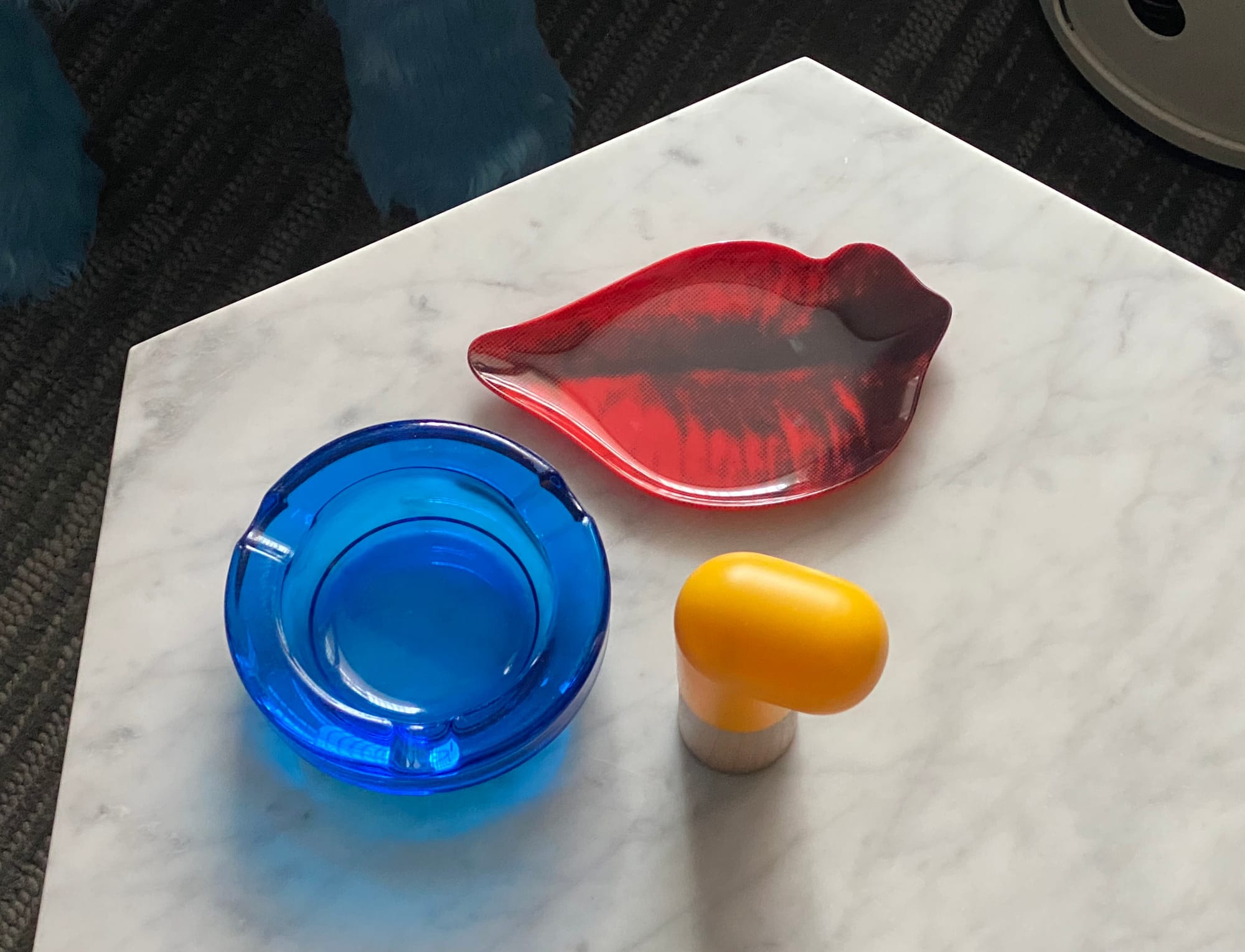
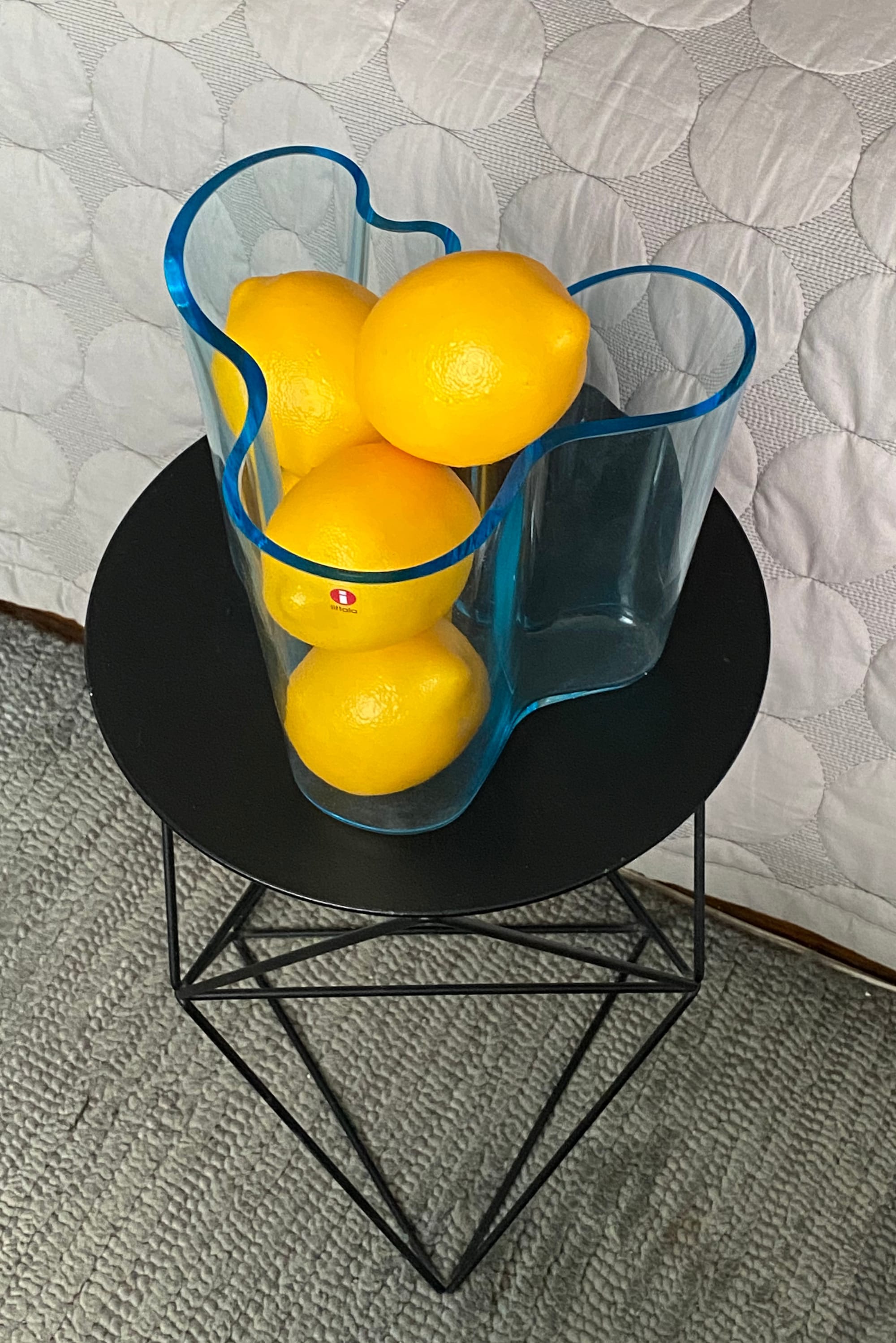
The nice thing about red-yellow-blue together is they instantly convey a sense of completion. You don't need to be fussy about where the coloured objects land, just plop them on a tabletop and see what happens:
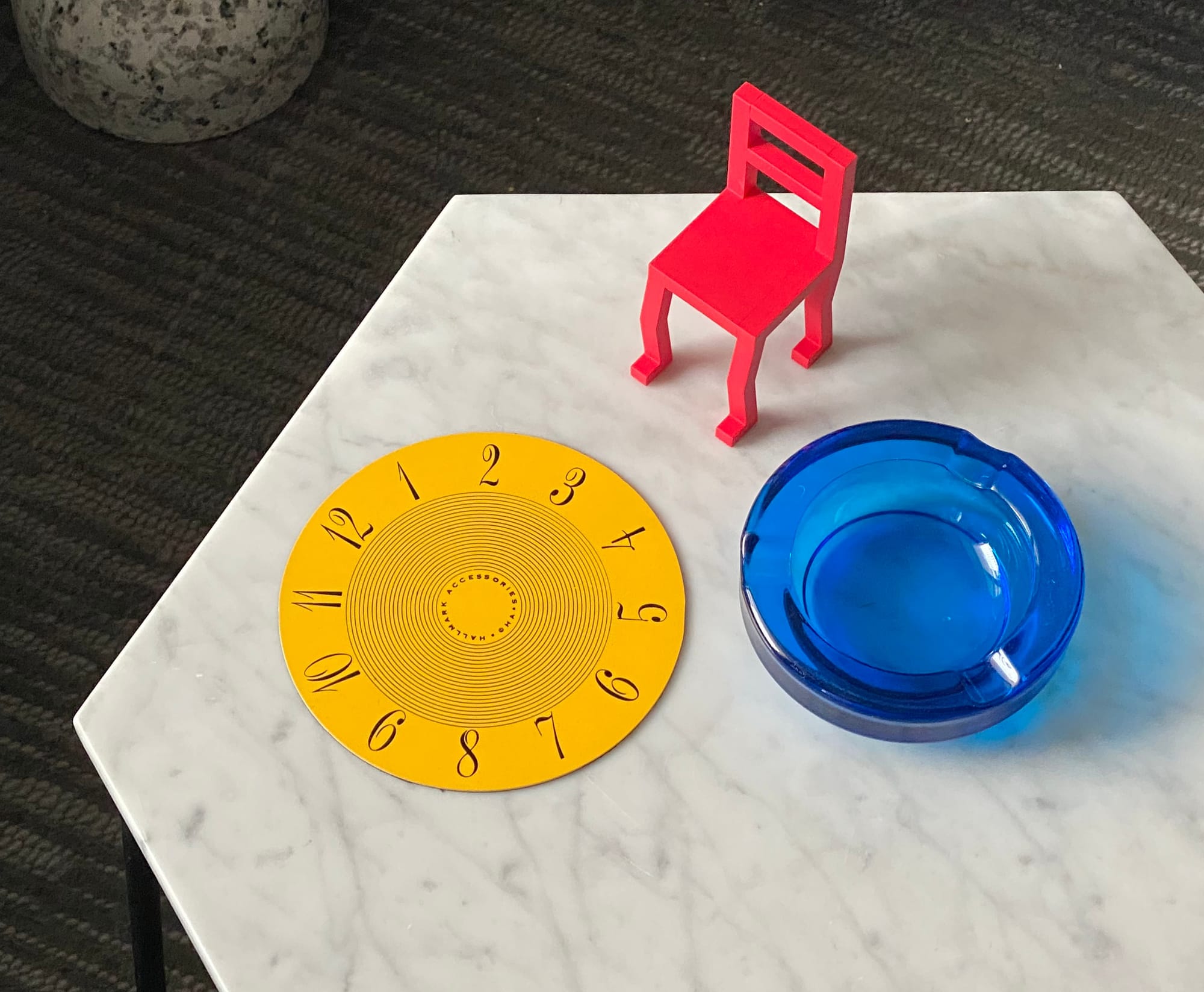
That said, experimenting with proximity can be a fun way to waste some time:
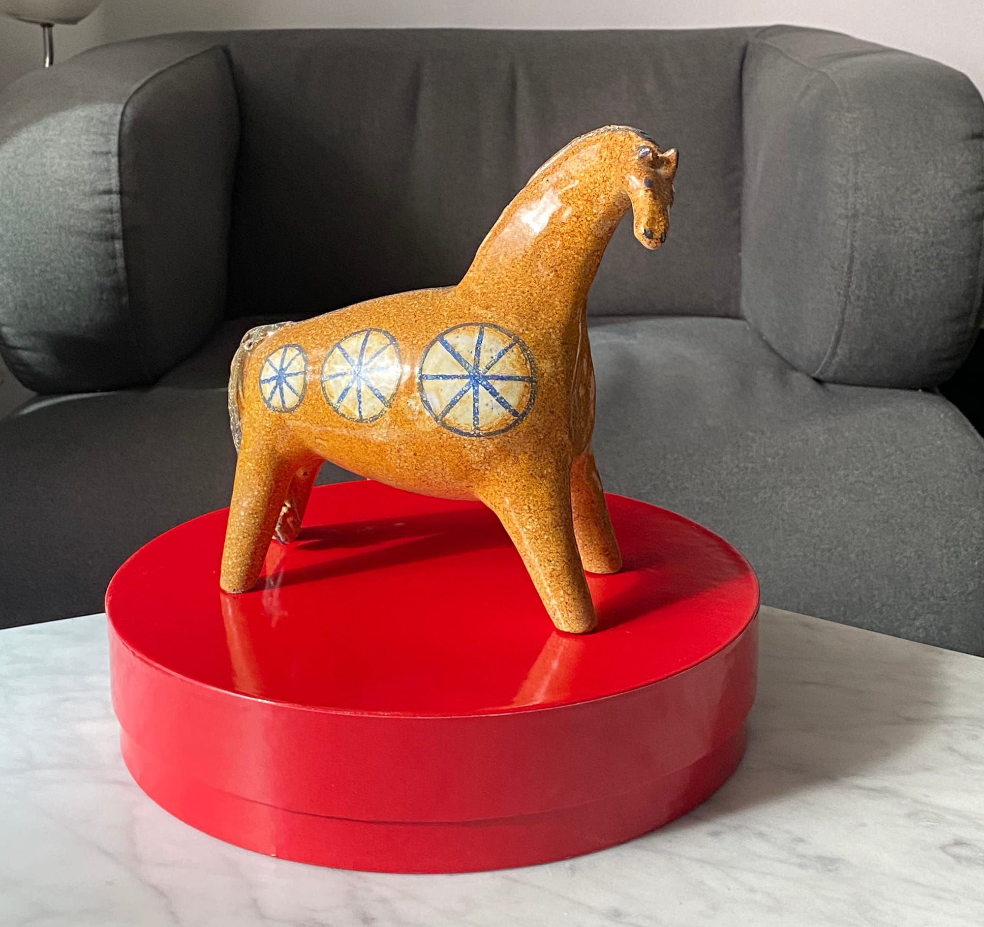
Pick the right objects, and you might end up in Pop-Art territory:
Having some red, yellow, or blue boxes around is an easy way to get started. They're perfect as pedestals:
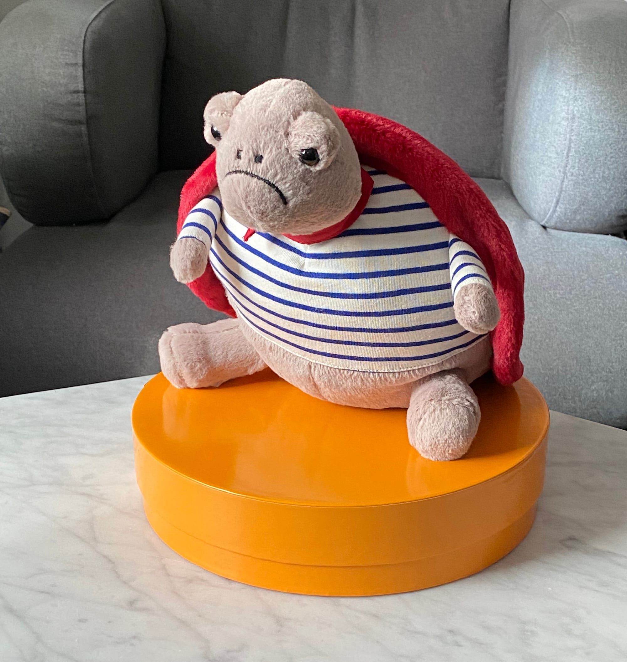
You don't need to be rigid about the colour selections either. Pick an adjacent hue and the magic still works. I'm a fan of substituting red with hot pink:
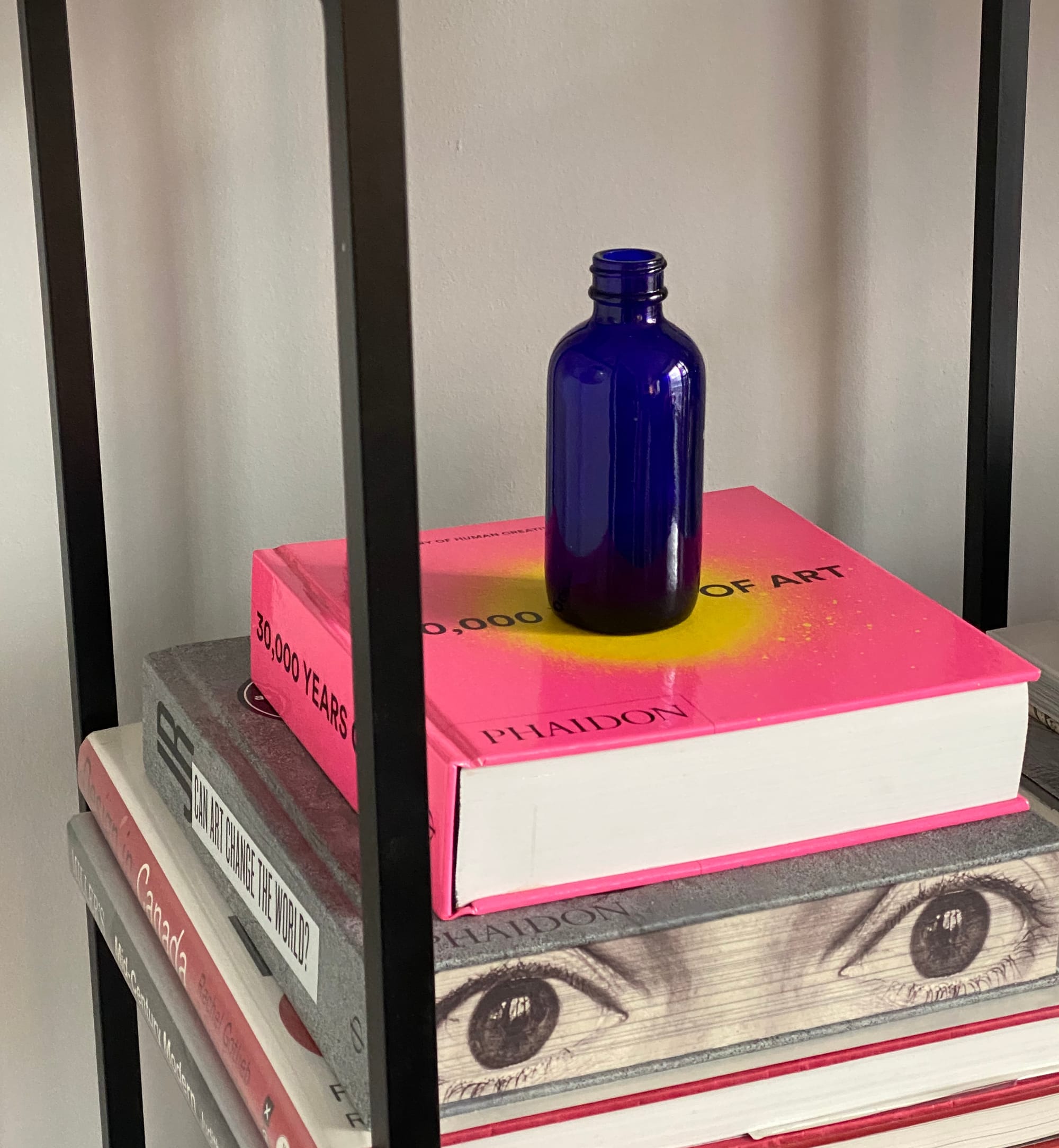
You can also monkey with the colours' proportions. Here's an attempt with lots of yellow, a little bit of blue, and just a touch of red:
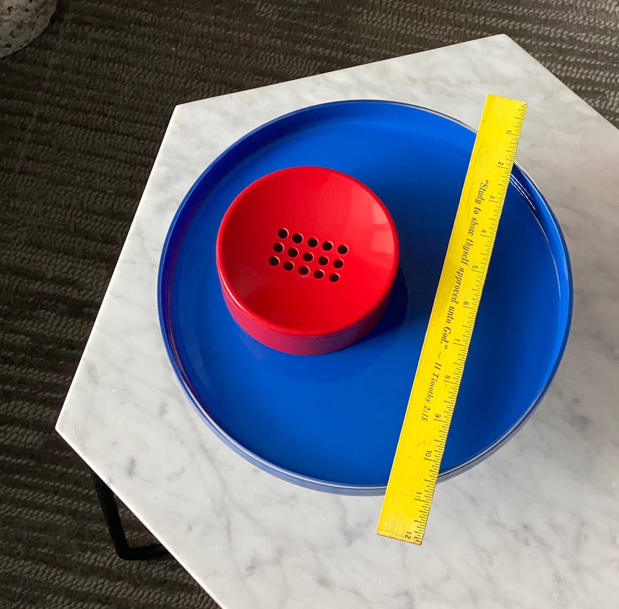
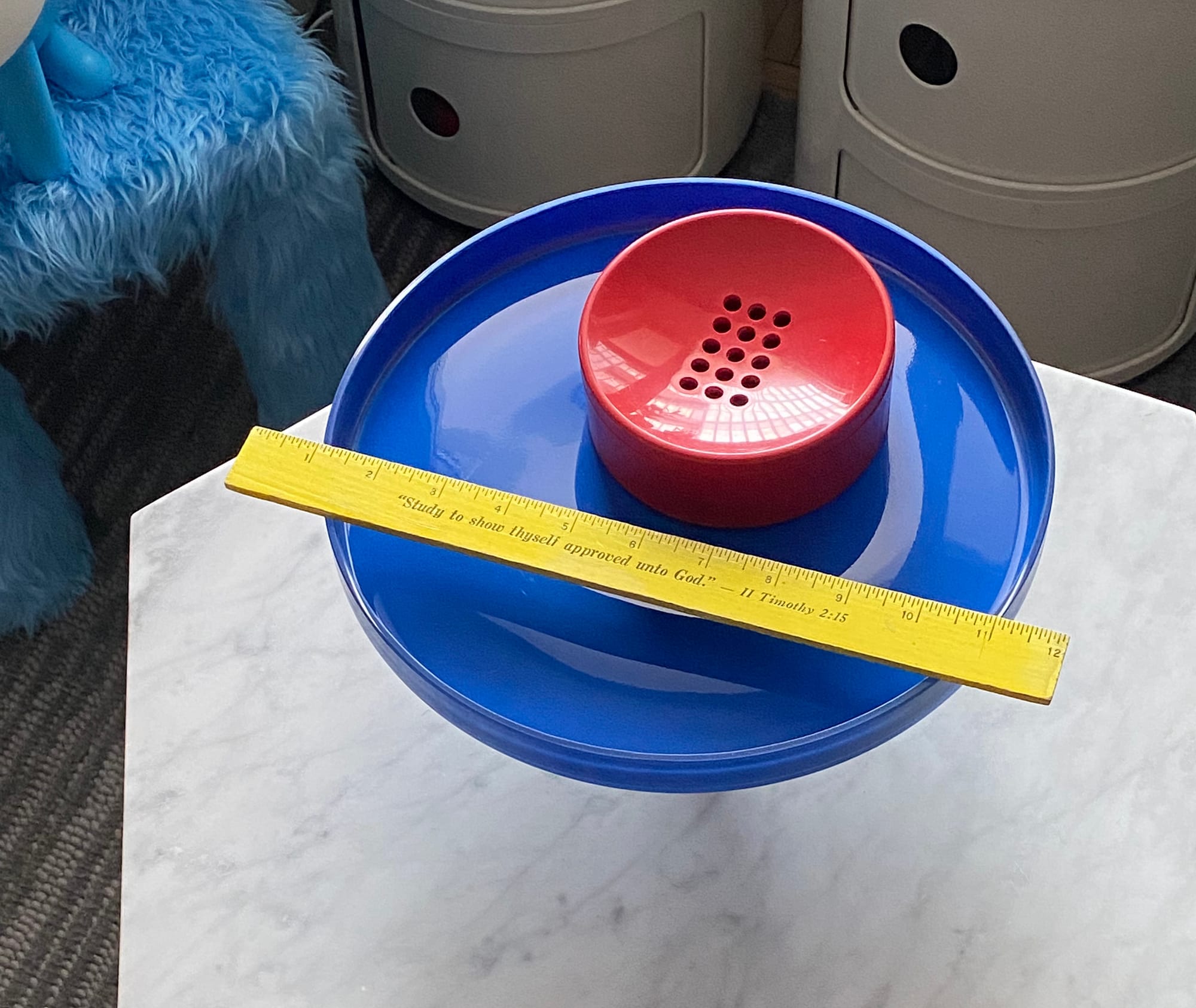
If you're feeling adventurous, you can go for bold collisions, placing super-saturated items on top of one another. Here's a cake platter from HAY, topped with a space-age ashtray and vintage ruler:
It's really a continuation of last week's playfulness, making use of things you already have. When it's too cold to go outside, isn't it comforting that everything you need to create indoor fireworks is an arm's reach away?
From the archives
Being smarter about colour is an ongoing theme at guy with an eye. Here are some highlights:
Eating the rainbow
Get a pep talk on busting out of your colour comfort zone.
The joy of unexpected colour
Find out why colour in unusual places delights.
Don't make this common mistake when choosing a paint colour
Learn how to avoid an expensive mishap on your walls.
Now turn your eyes from the bleak winter landscape to the possibilities of your home!
They can sign up here. It's published on Wednesdays.
Thank you for reading.


Member discussion