
Strong colour + bold shape = kapow!
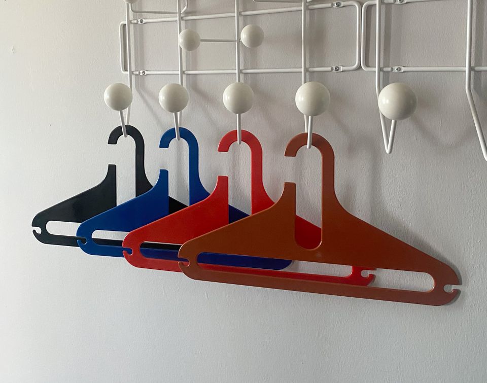
Is there a formula for a compelling design object? I doubt a universal one exists, but I recently discovered one that works for me. When I looked at the small collection of things I brought home from Montreal, I realized most of them had one thing in common. They combined intense colour with a simple pared-down shape, producing a forceful optical allure.
So, let me take you on a quick tour of five Montreal shops, including what I picked up and why.
Chez Floh
Chez Floh is a new venue devoted to vintage housewares, a spinoff of the secondhand clothing shop Marché Floh next door. Its logo, a yellow sofa with a crumpled smile, perfectly captures the appeal of timeworn things – they're winsomely seeking new owners, carrying some of the love they experienced before along with them:
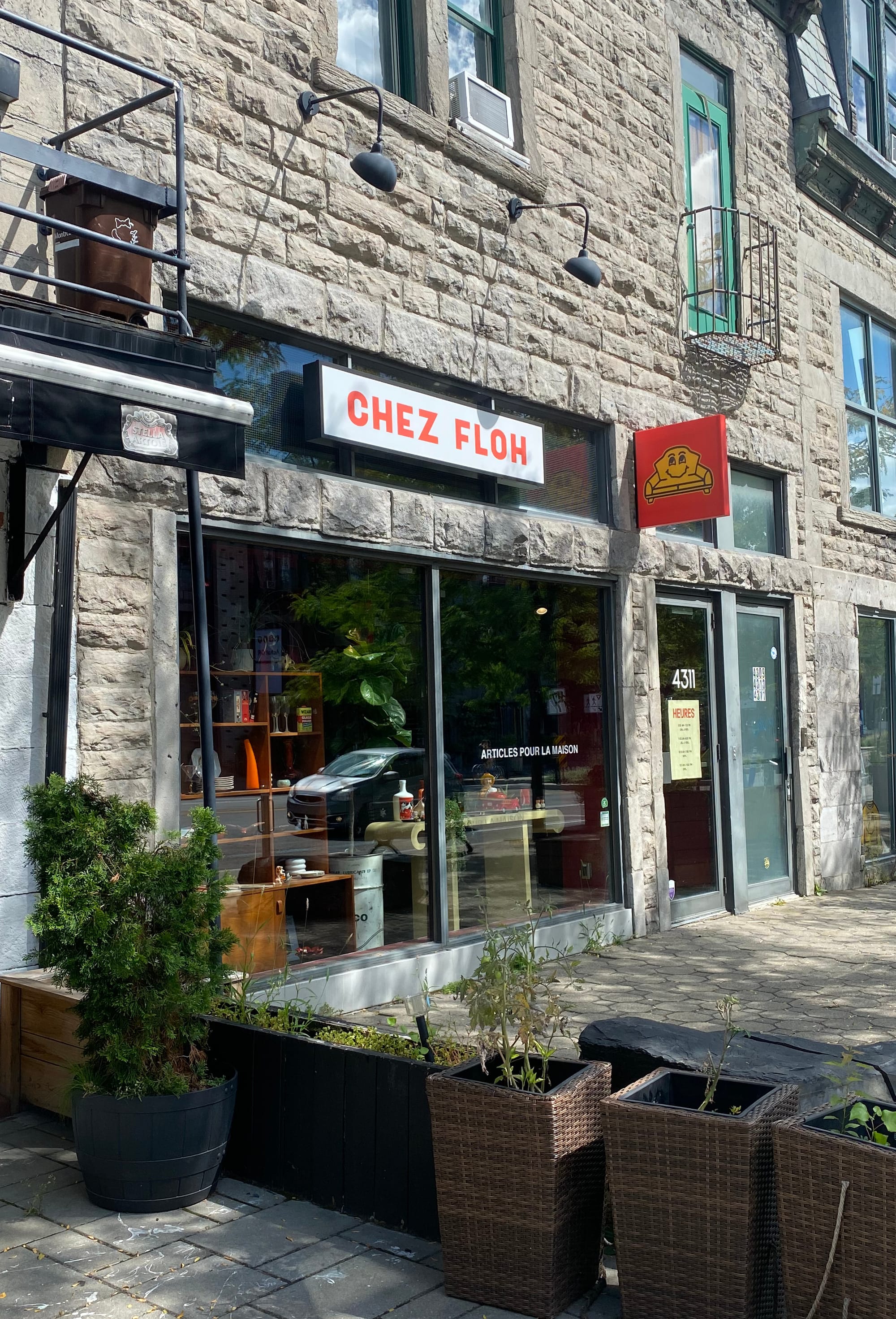
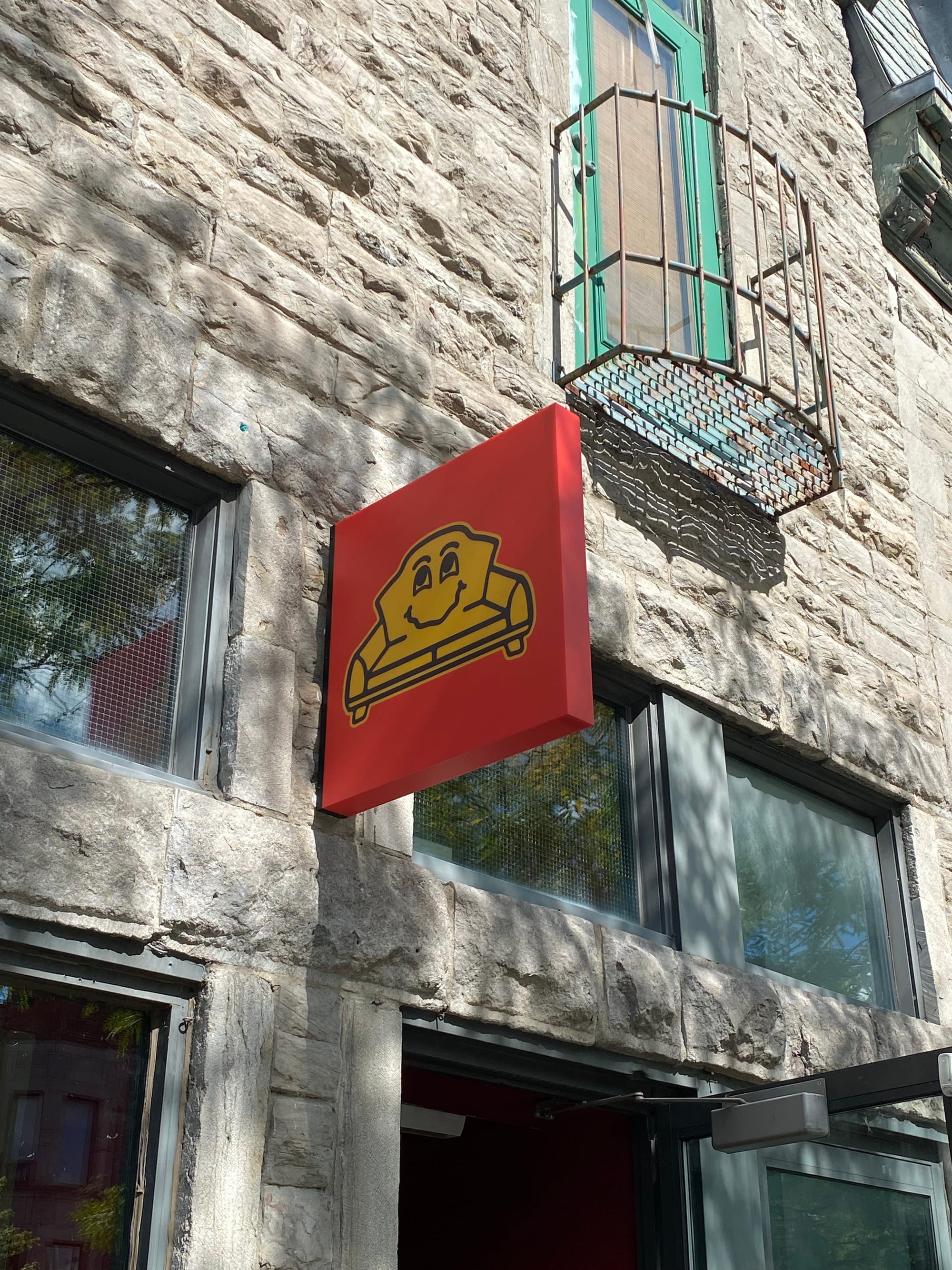
Photos: Corneil Van der Spek
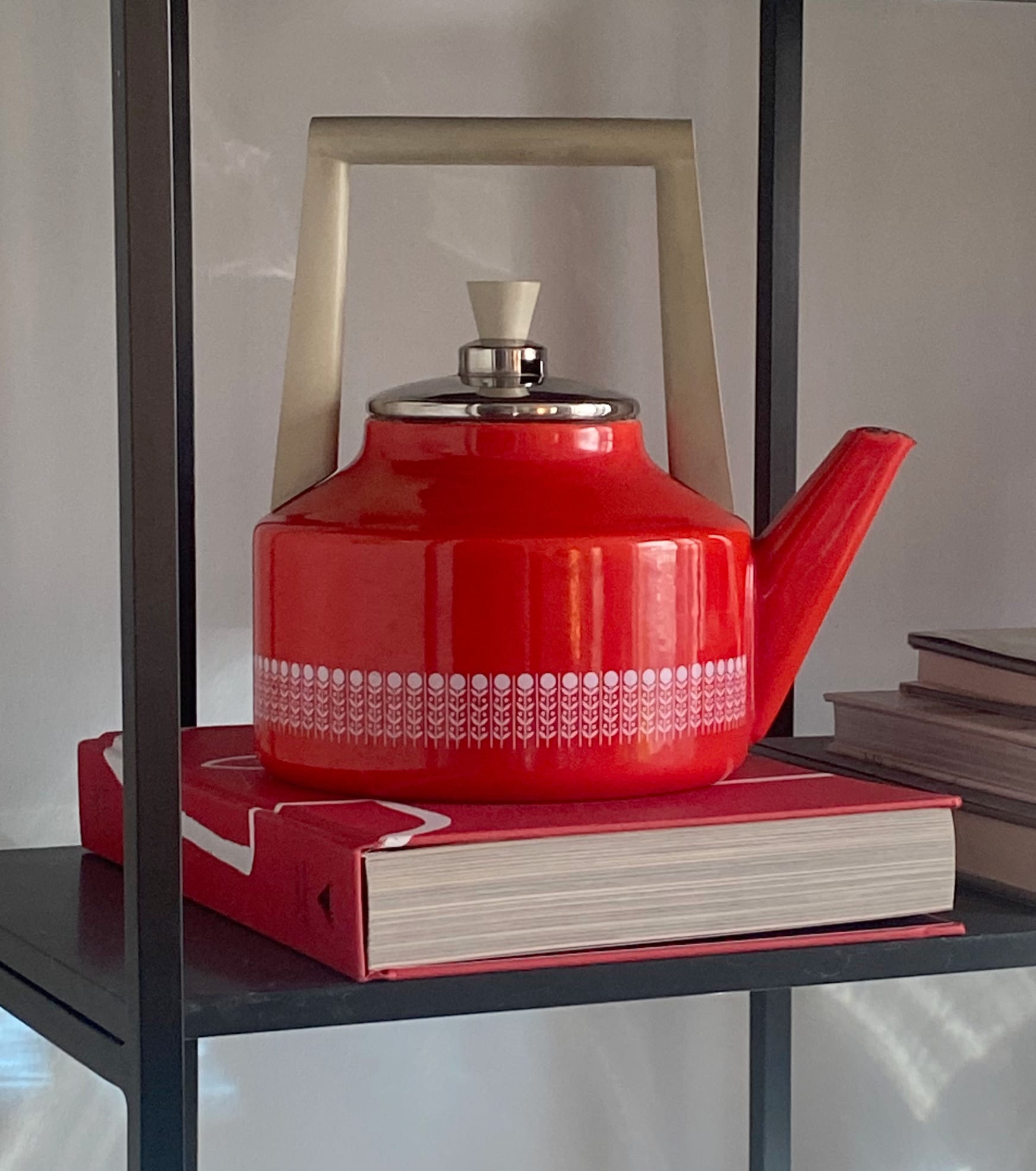
The items here may not have a design pedigree, but they emanate style, and are also available for a reasonable price. A kettle in the window grabbed my attention with its overheated colour and sharp angles:
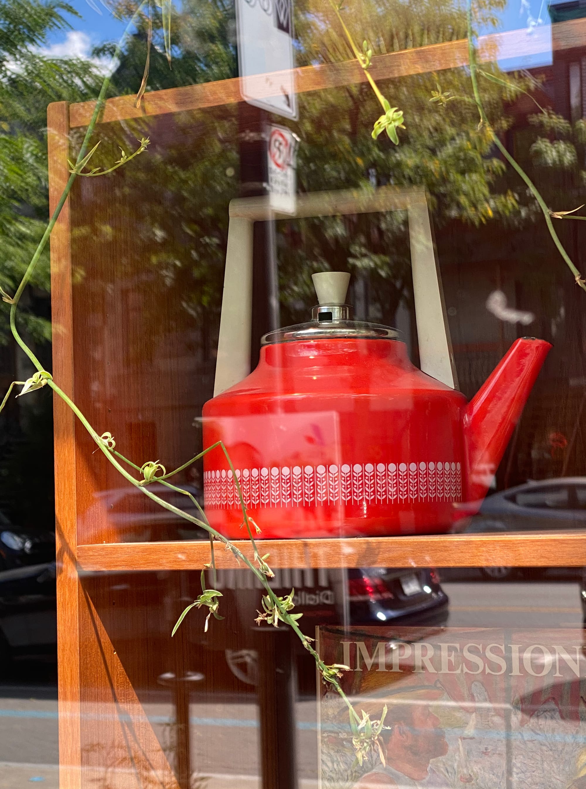
It's now a handsome presence on the étagère in my dining room:
Aside from candy-coloured home accessories, you'll also find lots of paper treasures here, like decades-old issues of Andy Warhol's Interview magazine.
Full Room
Last summer, I wrote an extensive piece about Mathieu Leclerc's showroom Full Room in the north end of the city. It's a combination workshop and museum-quality display, where mid-century industrial designs find new life – and where you can enjoy first-person history lessons from the owner. I knew that I'd find some exciting pieces to bring home, and I did. A set of Finesse hangers from Japan are now brightening up my entryway:
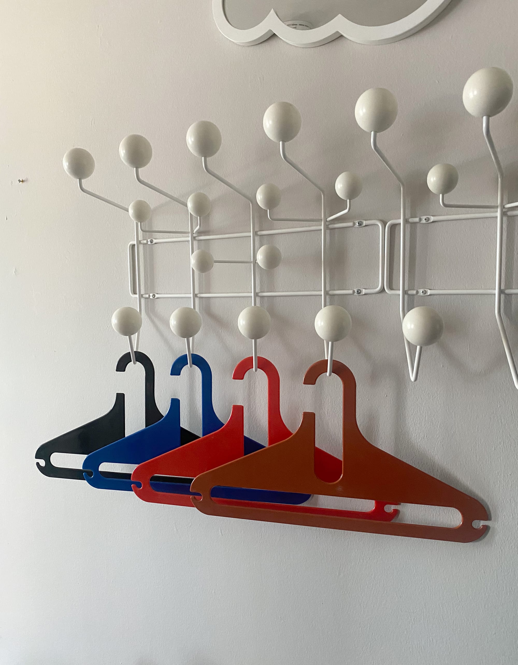
Unfortunately a fifth one, brown, snapped in transit, so I'm going to try Krazy Gluing it back together.
The other find was a blue 1980s attaché case by Michel Dallaire, now appropriately stationed in my home office:
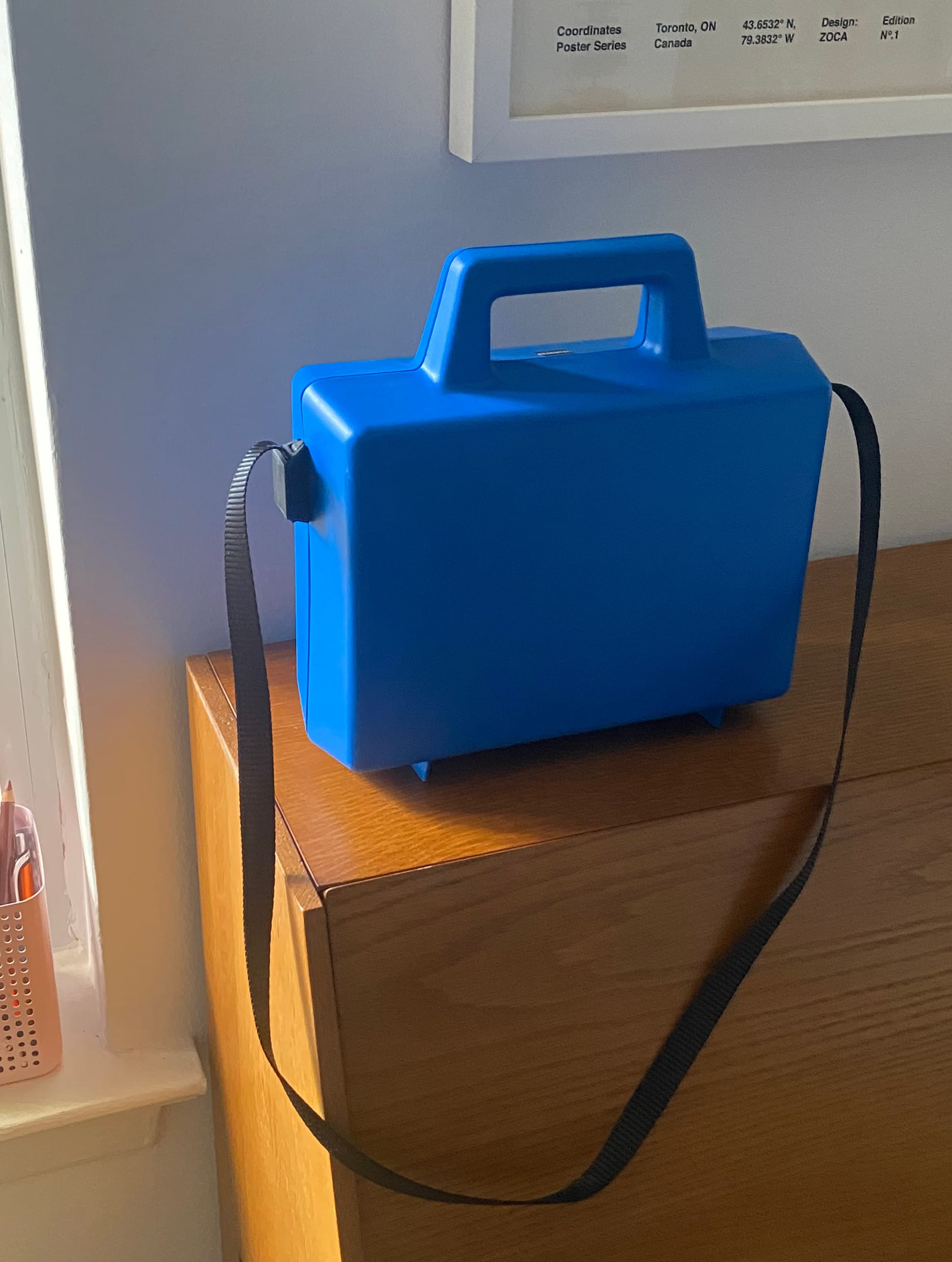
Somehow it fuses business-like function with the fun of a kid's lunchbox. One day I plan to carry it on the TTC during rush hour, to disrupt the grim procession of black shoulder bags and overstuffed backpacks.
The power of colour plus shape is well represented on the Full Room website, where products dance in dizzying formations:

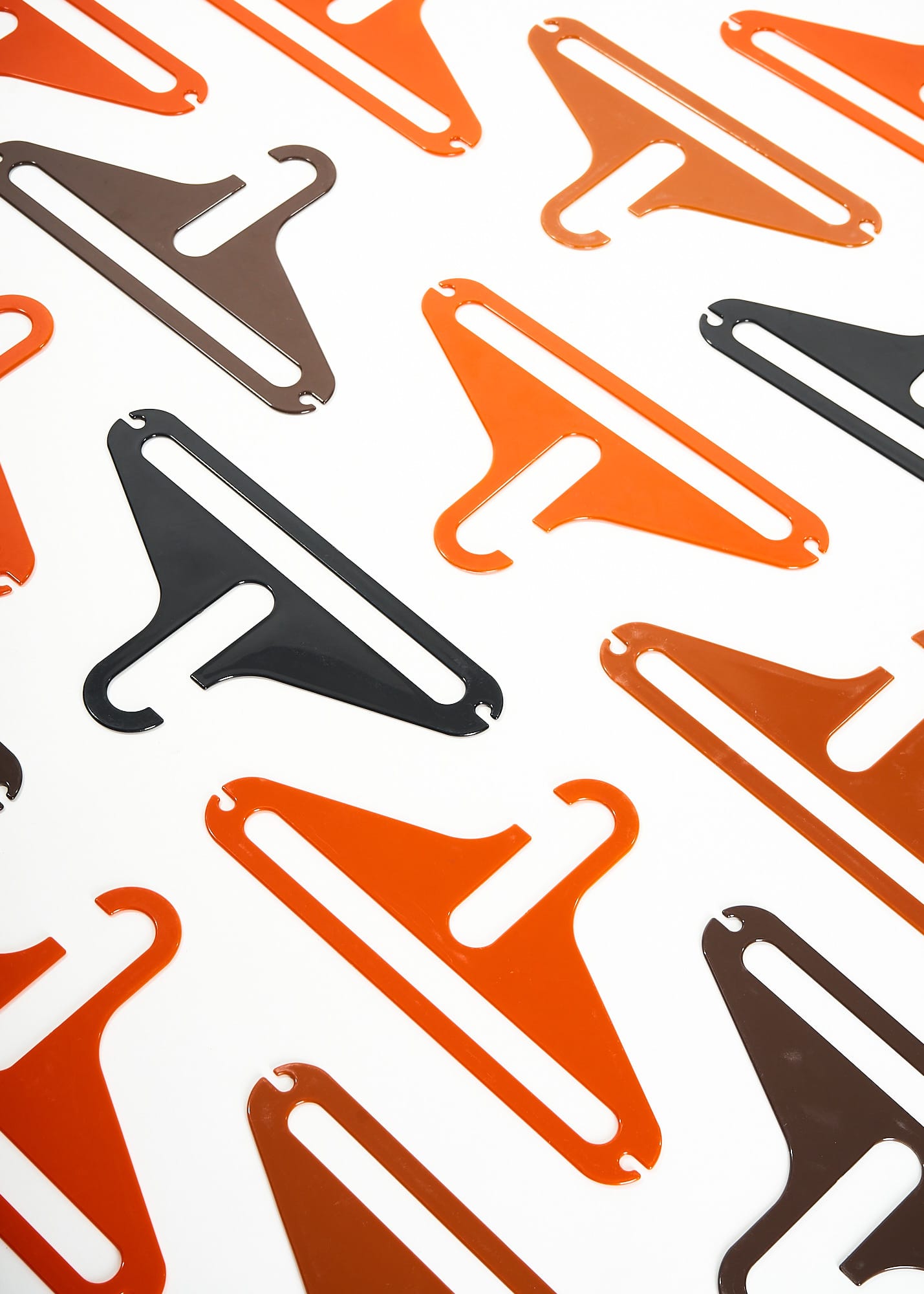

Photos courtesy of Full Room
The witty choreography may well convince you to buy a collection of items, instead of just one:
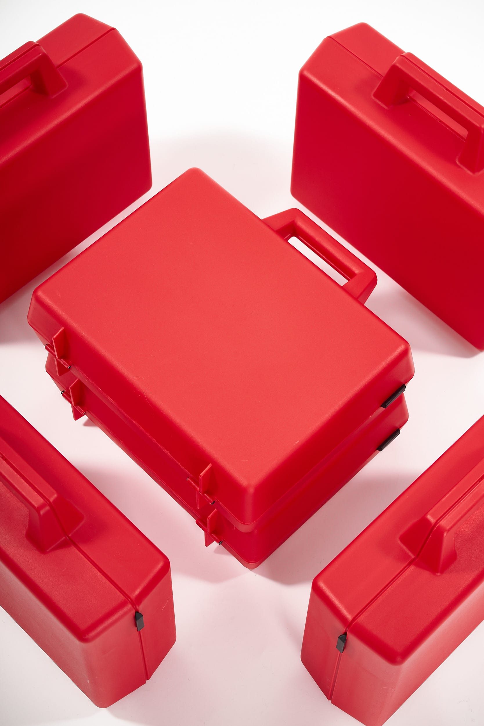
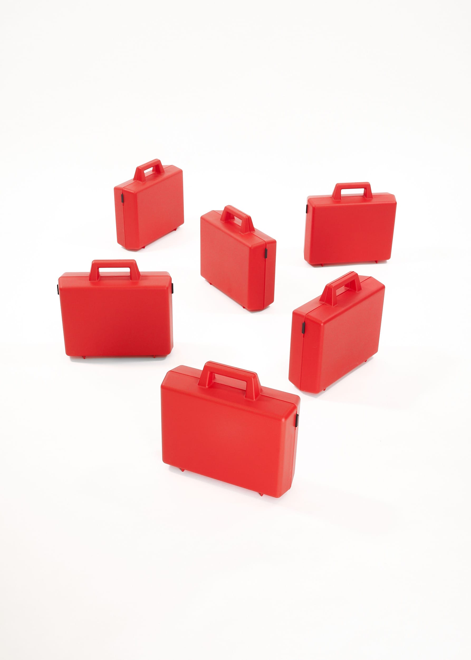
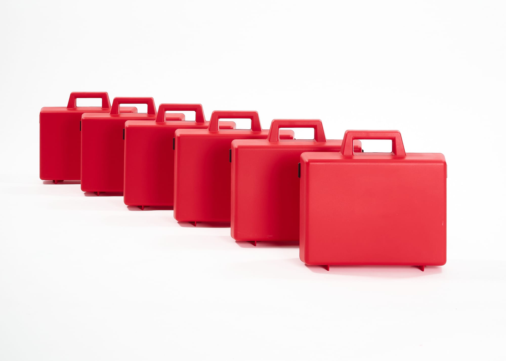
Photos courtesy of Full Room
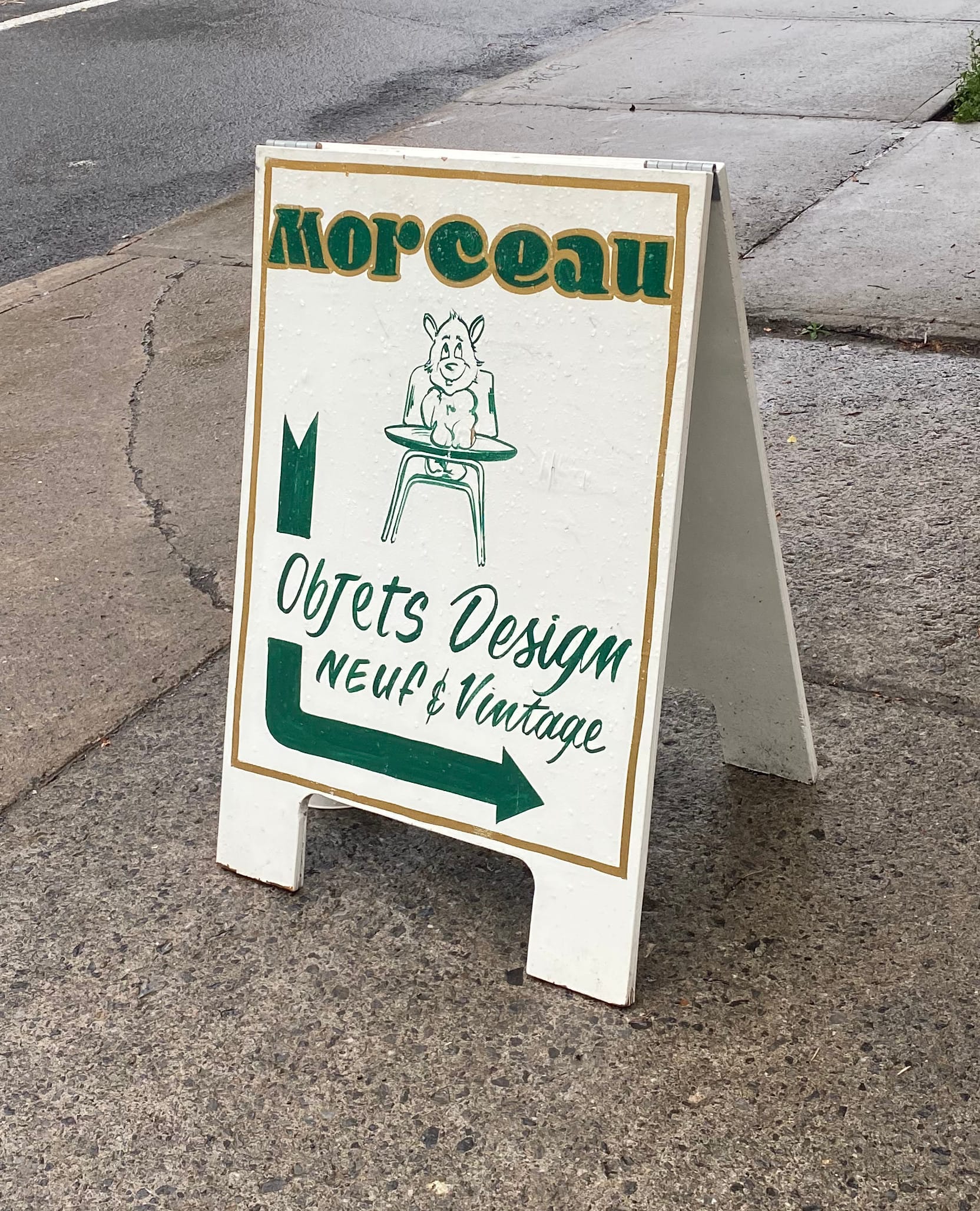
Morceau
Morceau is where you'll find an intoxicating mix of design classics that are still in production and vintage pieces with star power. One of the signature items is the Ring-A-Date perpetual calendar – you may recall I sang its praises last summer. I've had the white model with black rings for a while now, the one visible in the store interior photo below:
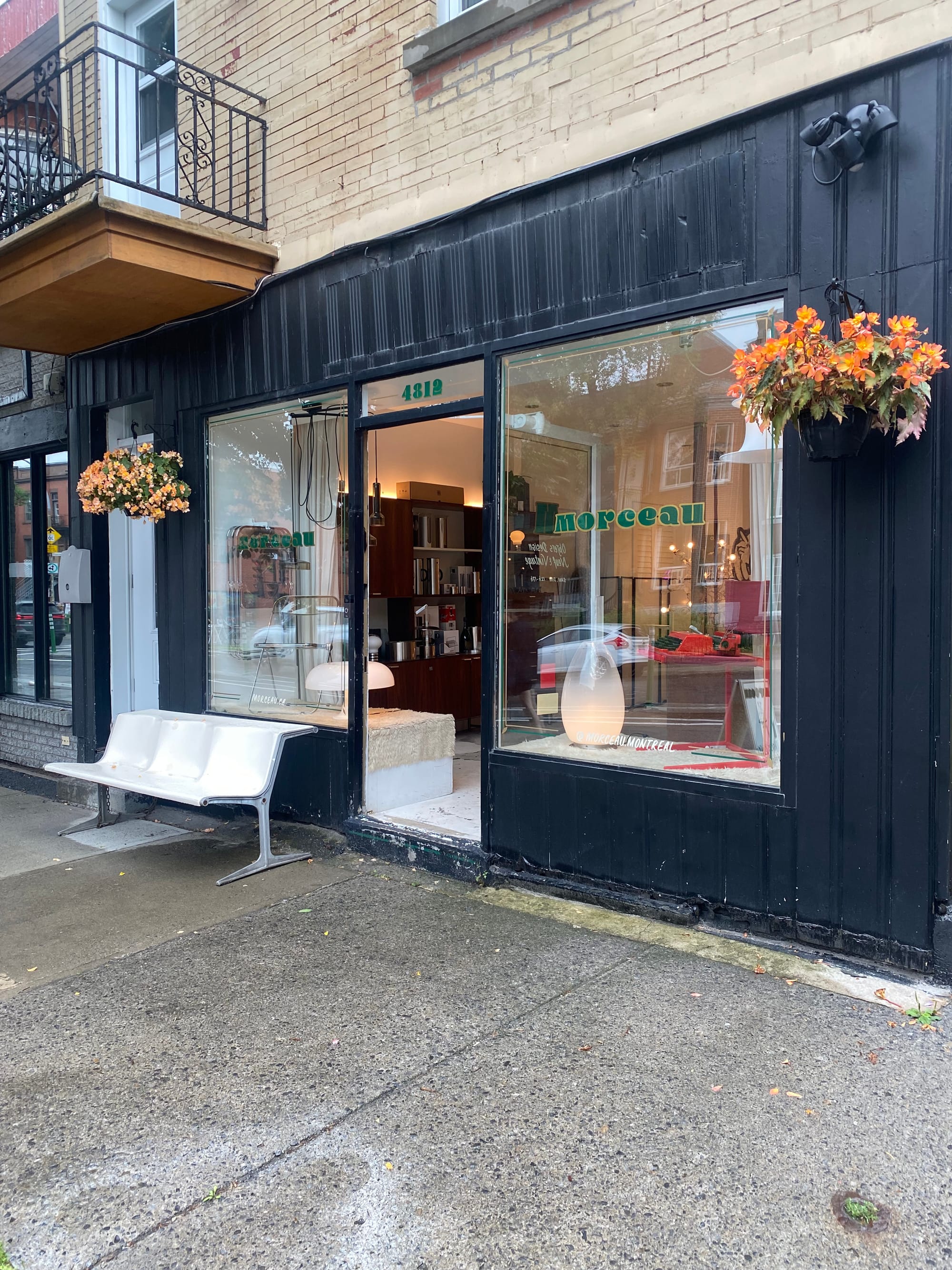
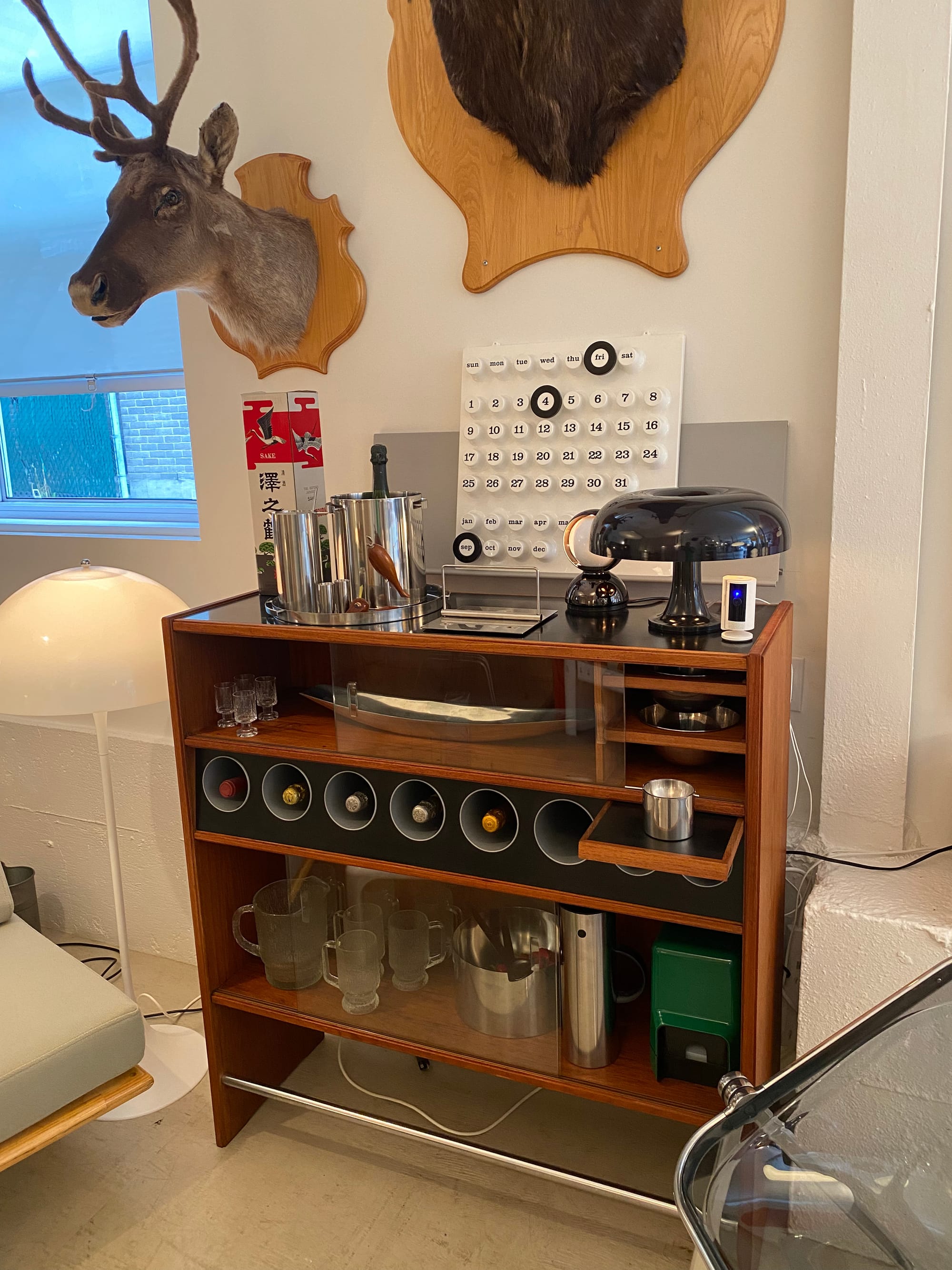
Photos: Corneil Van der Spek
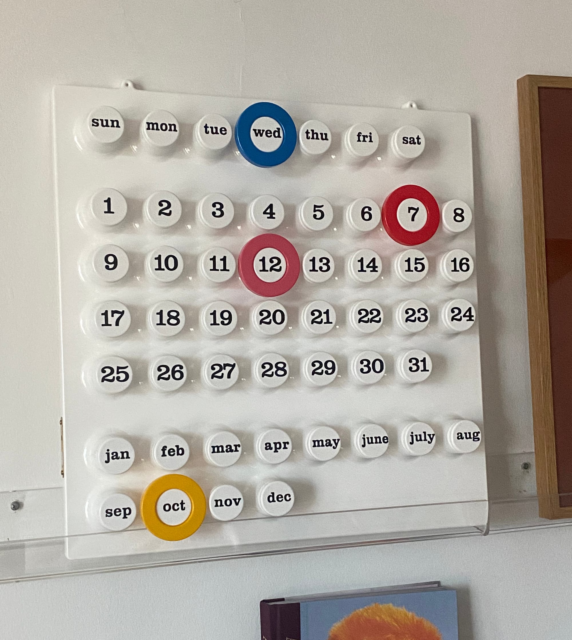
All along I've known that coloured rings were available too, and I finally acquired a stack of them:
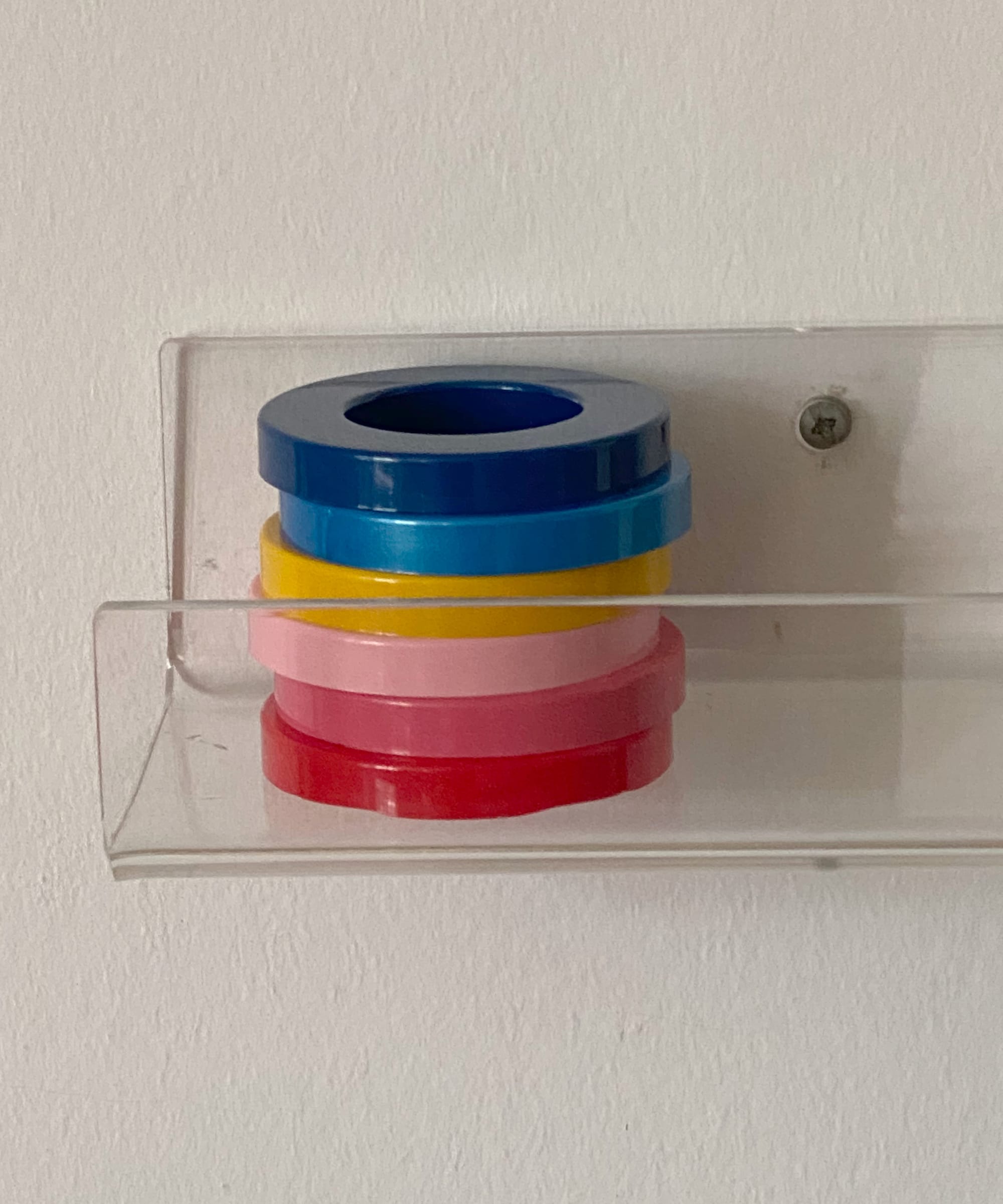
I noticed that orange was out of stock, maybe predictable with October on the horizon, but I have enough possibilities to keep the calendar lively for months:
Magasin Général Lambert Gratton
There's a corner store in the Plateau that combines childhood pleasures like candy and gum with a well-curated selection vintage finds. Its name is impossibly elegant, le Magasin Général Lambert Gratton, and I always end up with something impossibly unique – and inexpensive – to add to my collection. This time it was a pair of yellow objects that have a new home on my space age coffee table:
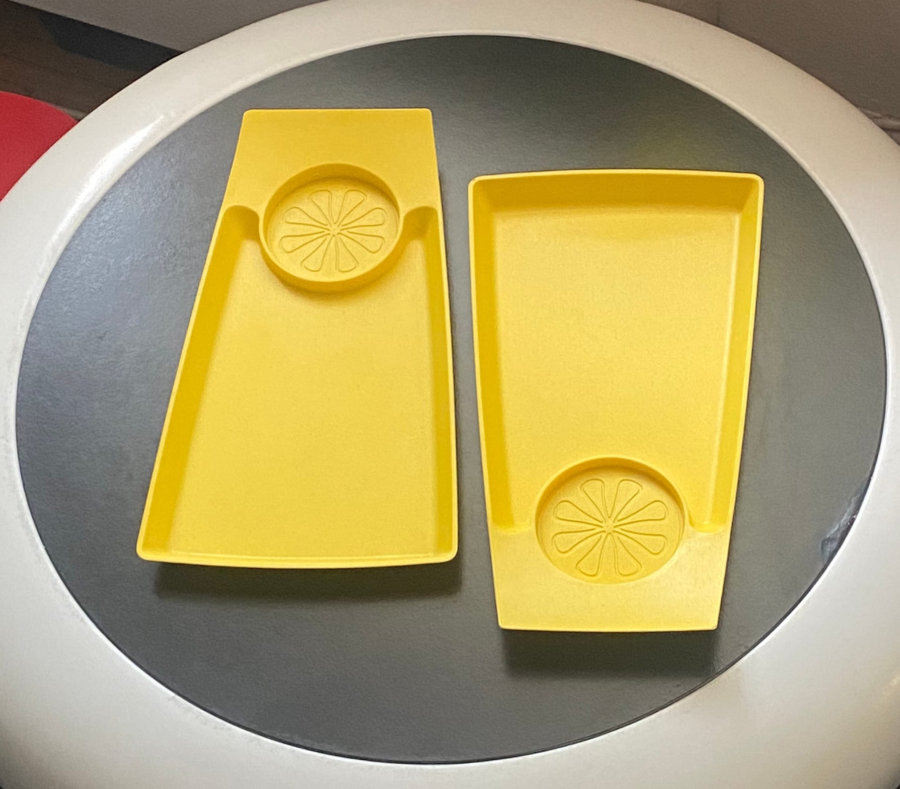
At first glance, I didn't know what they were for, but with the shopkeeper's help I recognized them as trays for a drink and a snack. I think they're just as delightful as a pair of exclamation marks:
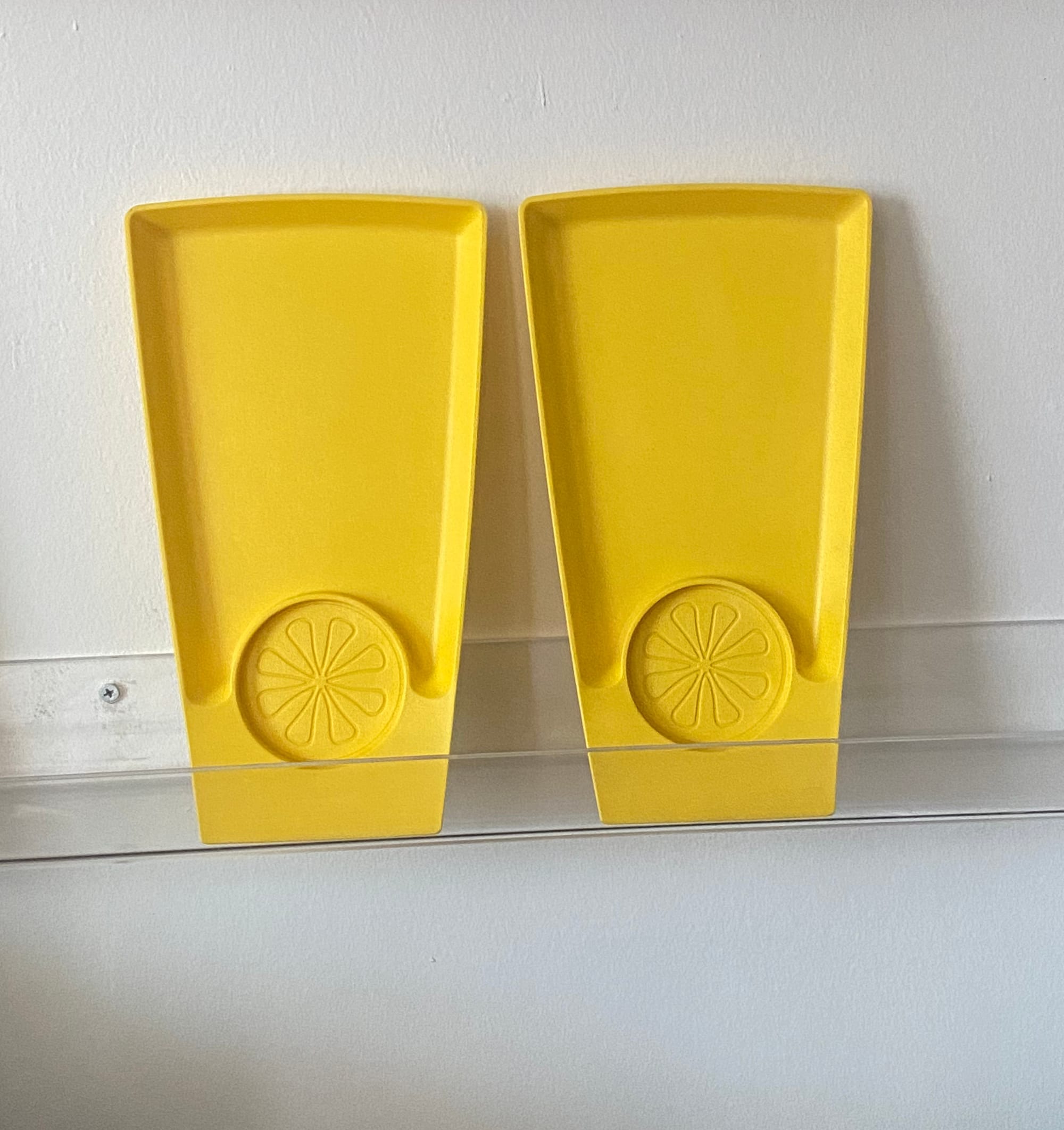
When you're in Montreal, this shop is also a great spot for finding postcards with whimsical illustrations that play on local motifs.
Jamais Assez
Jamais Assez was one of my favourite housewares shops in Mile End for years, making an appearance in this newsletter back in 2024, so last summer I was upset to find it closed. Thankfully, it's been resurrected recently by the son of the original owner, and its punchy red facade is hard to miss:
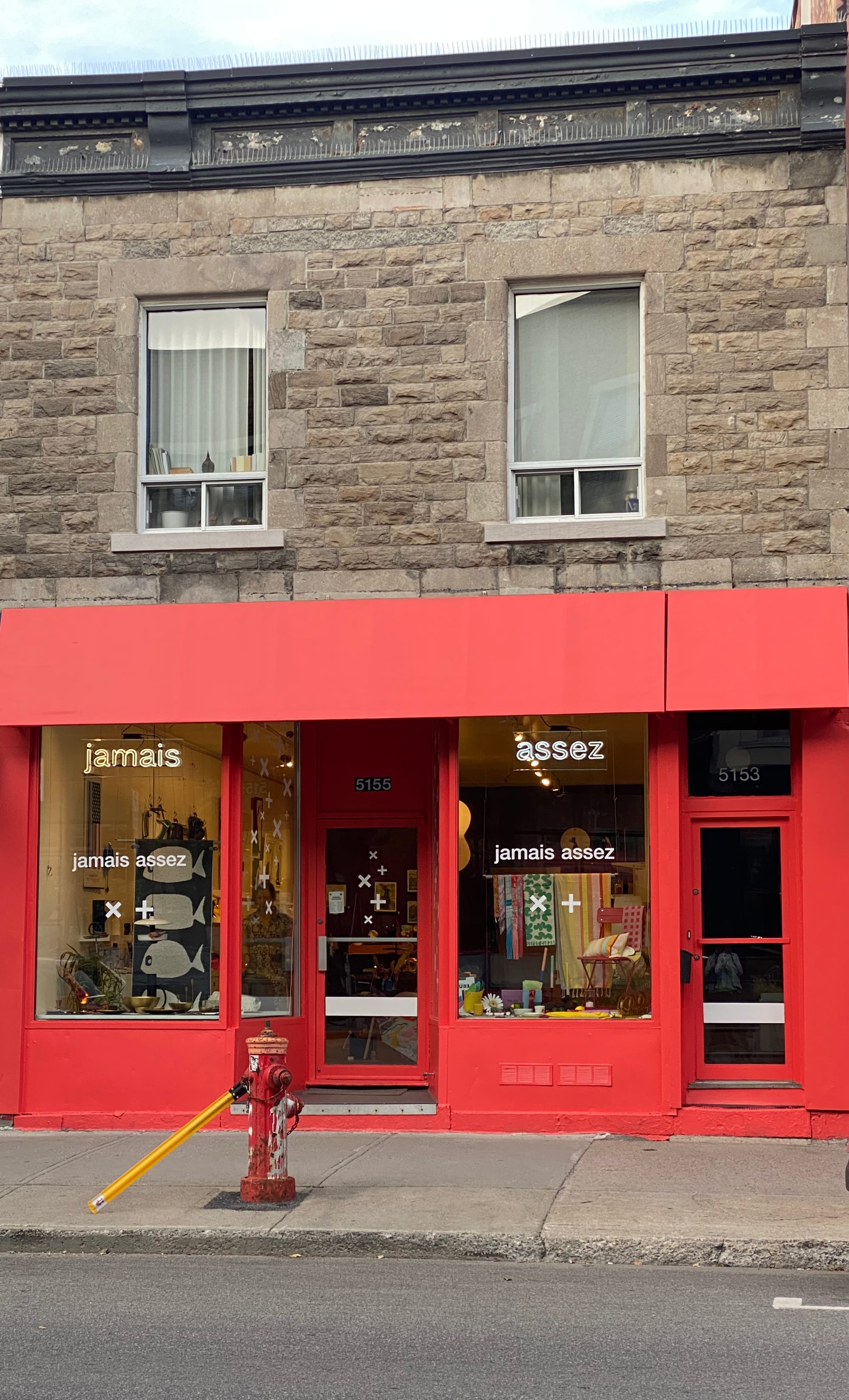
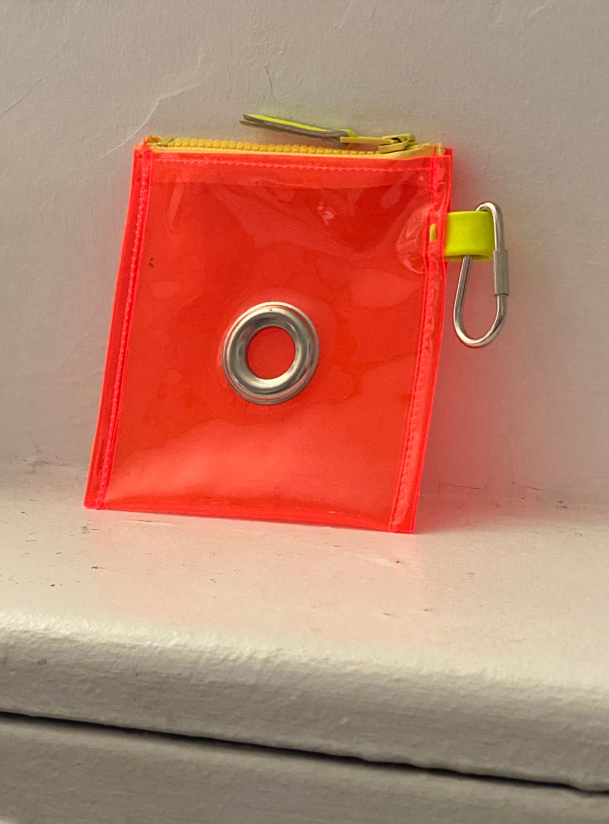
The shop is still packed with things that will add an exuberant touch to a tired space, and the selection is more colourful than I remember. I don't think I'm the type to have something dangling from a bag, but I snapped up this portable pouch anyway:
It's great to see this design destination revived and still in the family.
One of the reasons I love Montreal is the fearlessness about intense colour you find everywhere. One day, I spotted some striking furniture through a window, and wandered into a corporate lobby to snap these photos:
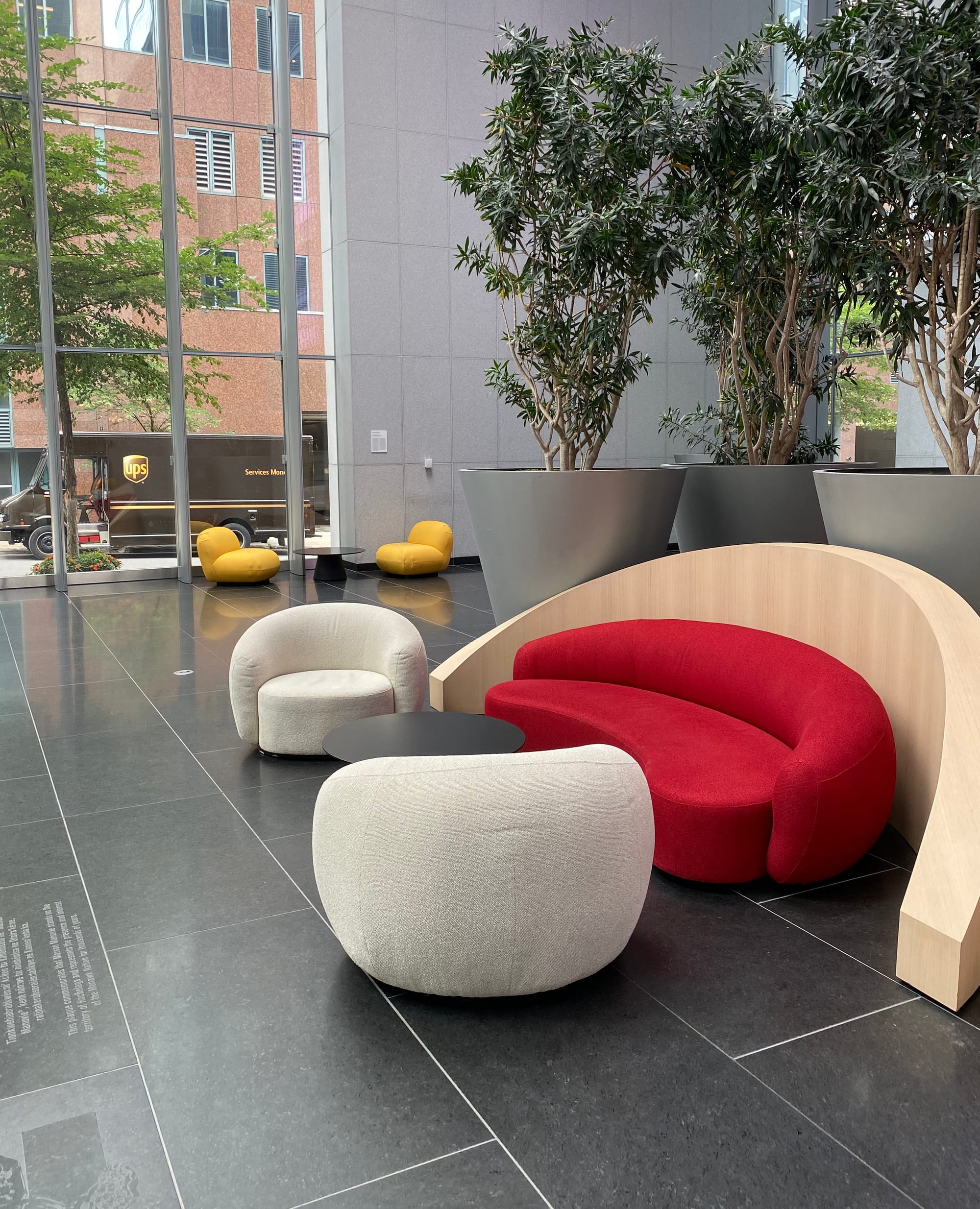
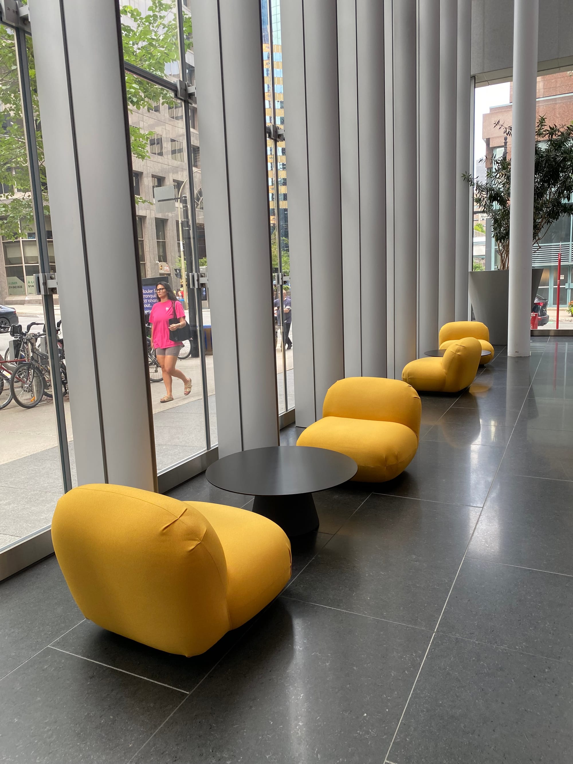
Photos: Corneil Van der Spek
It was the headquarters of Manulife Financial, and were this space in Toronto, I doubt it would be populated by red and yellow upholstery.
So every time I return, I have some extra chromatic courage, and a few pieces to remind me that being bolder is a fine way to live.
They can sign up here. It's published on Wednesdays.
Thank you for reading.

Member discussion